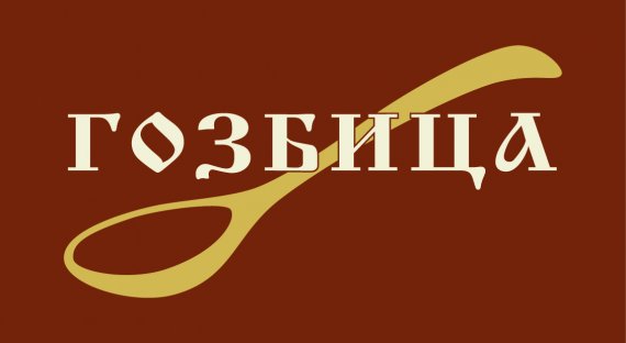
Gozbitsa (dish - eng.) logo - bulgarian spices
vet1111 | Mon, 05/14/2012 - 11:30
Brief from client
...

It is for Bulgarian spices in consumer packs. The colors are traditional for the plates in region (http://www.pochehli.com/userfiles/productlargeimages/product_387.jpg). As well the font is typical cyrillic font.
Thanks in advance for your comments and notes :)


8 Comments
Try to show more font options...
Is the text (brand name I presume) final?
The stroke in И fades into the spoon when viewed from further/smaller. The logo on packaging is bound to be small, this should be IMHO corrected somehow.
Yes, it's final. I found this site just few days ago, otherwise I should ask for your opinion earlier ... And about "И" - I think you're right. What does it mean IMHO? (sorry, I'm not a professional designer)
Neither am I, really. Just an enthusiast.
IMHO is not designer speak anyway, it is internet shorthand for In My Humble Opinion (variants IMO, in my opinion, rarely IMNSHO - in my not so humble opinion)
Just good enough for me. I like the colors and the simple way you choose to use the elements.Be careful with the strokes on fonts, the rest is fine.
I would also like to see more options on the typography. Its difficult if you can't read the language... The spoon is ok, but very common. Can't you use herbs or something to represent the spice?
I like it but I would like to see it on a white background as this is very constraining for the logo as it has to be on this background. Try incorporating the colour in the font or symbol.
i´ts read rosquilla, maybe put a symbol like that