Graphics Network
csahli | Thu, 07/23/2020 - 18:21
Brief from client
Client wants to rebrand their existing business name. They provide branded items for corporate customers - promo products, custom wearables, printed materials and gift items.
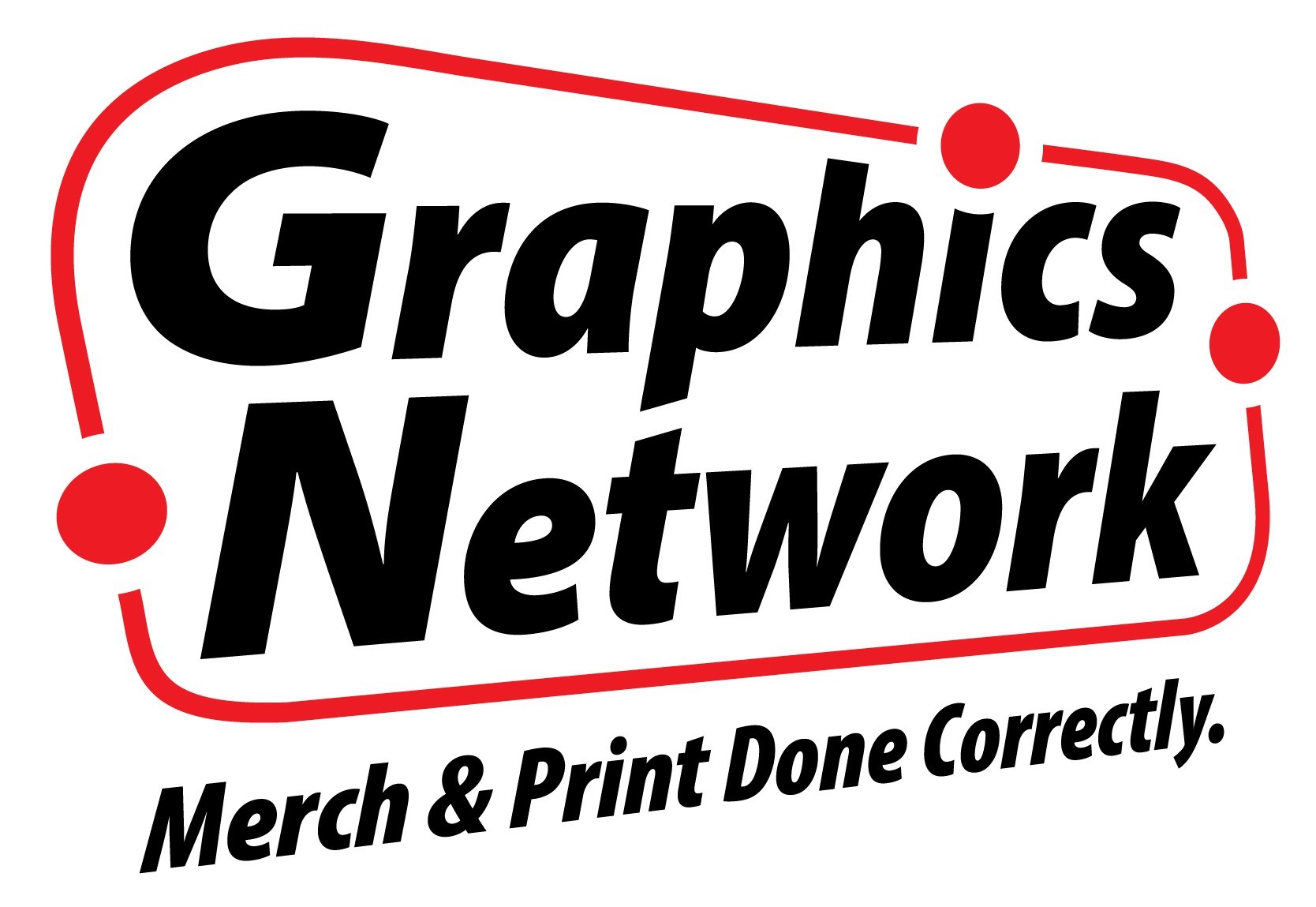
Company name as the focal point of the design - company resells all their products, which they source from factories in their industry, on a project-specific, item-specific basis. It's well known among the company's clients that they are a reseller, and they work with sources all over the world. The perimeter graphic is visual representation of their 'network' approach. Tagline is added to explain what the company does.
4 Comments
It's a dynamic symbol, which is good. I like the red dots circling the logo. But overall the logo looks a bit raw and 'salesy'. I don't have any concrete recommendations.
Could we see the original logo please? It would help us give you better feedback.
This is the original logo from 1999.
I like that it's bold. Strong clear colours and easy to read which is great.
I wonder if it's world wide reseller, maybe for the dots use red globes for the dots to bring home its networking around the world? Just an idea. The typography seems very sales oriented but little dated, would look into different typefaces personally.