Brands of the World is the largest free library of downloadable vector logos, and a logo critique community. Search and download vector logos in AI, EPS, PDF, SVG, and CDR formats. If you have a logo that is not yet present in the library, we urge you to upload it. Thank you for your participation.
Version history
Version 1

- I
- S
- T
- C


5 Comments
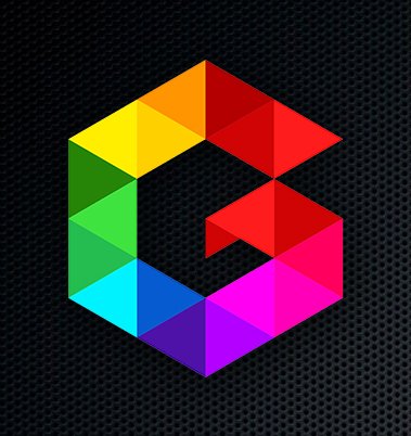
It a nice idea, but the brief is very badly put, maybe it's just me. I don't really feel the "origami" approach, it very symmetric to go as origami, it looks more like cubes, or a triangle snake. Also maybe you can try to put the name of the studio next to the symbol...you still have some work to do, but it's a good start.
Totally agree with dionisdei. You justify the logo, but the elements what tells are very poor, more like origami looks like geometrically new wave. And this are not a logo, this is a symbol, if you add this symbol in flyers, business cards and more, what do you expected the people think?, I know what is a studio design, because you tell this above.
You need more work in all the logo.
Not all is bad, the colors are very nice and i think you have the idea i your mind just what are still in proccess.
Good Luck and sorry for my bad english
I wouldn't be as severe as my compadres here.
I think this is looking good for now. It's not over yet but it's a good start.
i'd like to see the symbol without the background.
keep it up.
My issue with it is the fact that I feel like it's been done before. Reminds me a lot of the Game Cube logo, but with shapes + colors dividing up the logo. I also can't really tell that it would be Origami since Origami uses only one piece of paper (usually) per creation. Plus, the shapes don't indicate a fold enough for me to understand that
thanks for comments. to be edited...