Grey Castle
B.R.T. | Tue, 05/23/2017 - 05:36
Brief from client
This logo is for a local game/hobby shop that specializes in board games, card games, and video games, along with other hobby products. The client wishes to create a fun environment for families.
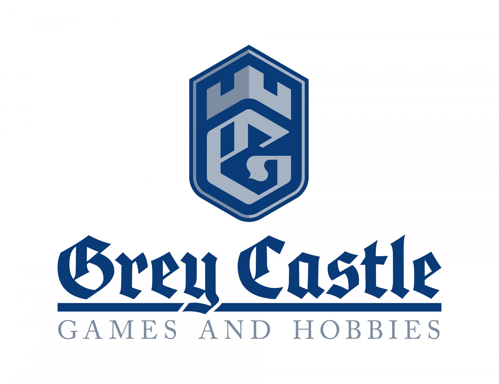
Since the theme is castles and gaming, I decided to use a black letter font and incorporate a medieval look. I created a custom "G" and shaped it to resemble a gaming die (20-sided or 6-sided). After some sketching, this is one of the concepts I came up with, but I'm not sure if I'm heading in the right direction. I figured I'd upload this and see what you guys thought. Thanks!
5 Comments
Too close maybe?
horz. version
The White Castle rip off was my thought as well.
Dang, I didn't realize how close they were. Back to the drawing board I guess. Thanks!
Shame, it wasn't even a bad logo concept.
It is just obvious a few research elements escaped your notice.
Take a closer look at some Dungeon and Dragons/Pathfinder/Warhammer pieces of art for inspiration, if that's the style you're going for.