Grocery
lexuss009 | Fri, 06/19/2015 - 17:09
Brief from client
Maribel´s Glocery and IceCram store
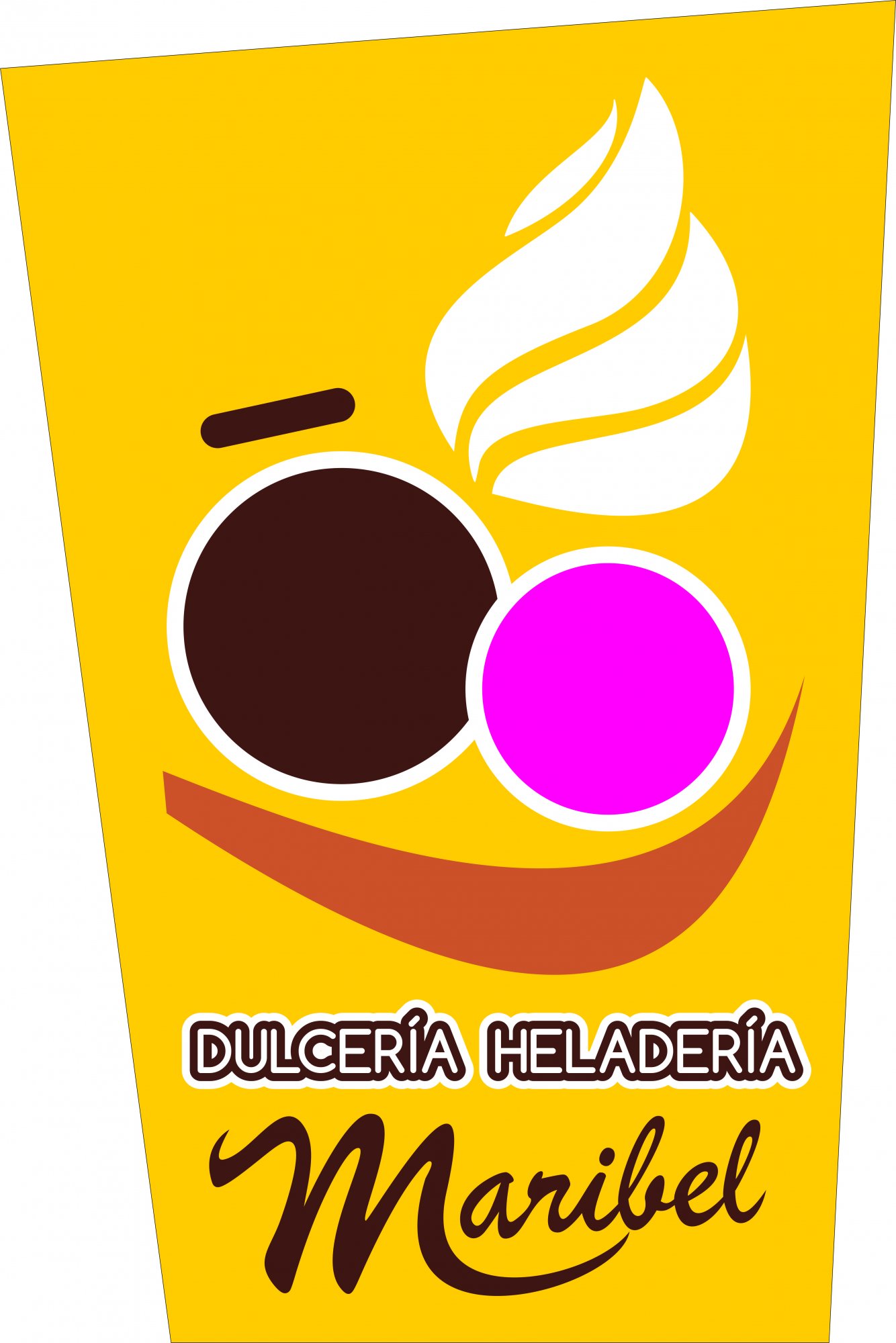
this desing respond to a privet businnes of ice cream and glocery sell, i let your for discoss any comments are welcome and appreciate
lex
8 Comments
I like the idea behind your symbol, but I think it needs a little more thought put into it, it looks like you went with the first draft.
The strokes on the DULCERIA HELADERIA are too much. Extra strokes can be playful and fun but not here, maybe in something more child oriented. MARIBEL looks to generic, which is usually the problem when using a script font, hand lettering would be much more appealing. If you don't have lettering/calligraphy skills collaborate with someone who does, or search for a unique font and stay far away from the script fonts that came with your computer.
The biggest hurdle you have here is your symbol completely overwhelms the text. On a big sign outside the shop this would be a decent layout, but for a logo it's too much. Unless you choose to go in the direction where the symbol IS your logo, then of course you would need to keep the type plain, simple and to the minimum.
I think your colors are fun and appropriate, look forward to seeing your revisions.
Thanks for your commente, the strokes can be fix, and the tipography of the main Name was imposed by the client
Nothing should be imposed by the client. That's the recipe for disaster. These fonts are terrible. You're the pro, you're the one who supposed to know what works and what doesn't.
You can lead a horse to water, but you can't make him shut the hell up and do as he's told. Because he's a horse.
I don't mind the font, it's not bad except for that thick stroke the others have mentioned. The ice cream smiley is fun although it seems rushed and not refined enough.
My only real problem is the proportions. I'd imagine that this logo will be seen mostly on a sign outside the store, and perhaps printed on menus or napkins inside. In any of those situations, the lettering is too small to read easily, compared to the size of the icon. I'd rework this with more emphasis on the words and let the icon serve to accentuate them, not the other way around.
I'm sorry, this looks like a dog's breakfast, meaning too busy and too many colors, shapes and fonts. I like simpler logos that are symbols I can remember easily. I would start over if I were you.
Am I the only one who sees a humongous yellow plastic drinking container with things being dropped inside?
i had clients who were a pain...and if open my mouth i'd be in trouble hahah :D
anyways! over there's too many colors, the 2fonts dont go together