Group Fitness-Eccles Ice Center Off Ice
davishockey_19 | Sun, 07/29/2012 - 21:16
Brief from client
Create a logo for our new fitness room. Must include "Off Ice"
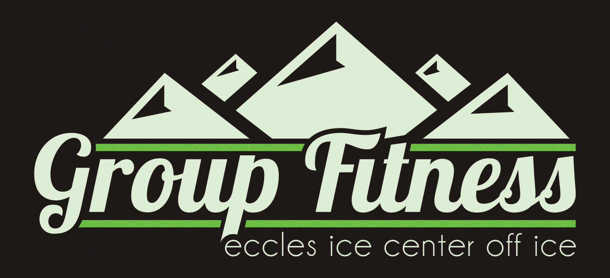
The rink is located up in the mountains, so I incorporated that into the design.
4 Comments
This type reads "Group Funess". The mountain elements look more architectural than like mountains. The color scheme looks minty.
I like it as starting idea. Give mountains some more natural design but keep the minimalist in details, also make them less. The font is ok but is place for better try something in the same style but highly readable, change the "minty" green with some "pine blue", or give a try with that, same thing for the whites on the font and mountains. You are on the right track here.
totally on the right track here loose a mountain or two maybe give them a little less structure and a little more fluid, and flow
the colors do look minty but would look pretty cool in some shades of blue and white! =)
Yeah I'd get rid of those two smaller mountains and change the detail on the mountains to something more organic (less architectural as was mentioned above) and try a few different colors! Maybe green and blue- but not a pastel green, keep the leafy green!