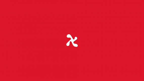
H Logomark
Brief from client
He is seeking a different and iconic mark that can be translated into a dynamic design system. The mark should represent Magnus’ personality and his most weird. and messed up side, which is something he finds important. It’s important that his mark stands out and appeals to the corporate and esports community. With this style will be added two typefaces, primary and secondary. All these elements integrated together should complement each other including color. Design direction and moodboards will be provided for the project.

I created it because I wanted it to stand out within the design community.
It wanted it to give a 70s design vibe, and at the same time feel weird (because of the shape)
Shown letter H but with like a "twist" (represent process(repeat pattern) the white space is pushing the letter H so that it makes it look splatter (meant to represent the repeat process) and different in terms of the community logos we otherwise see. The splatter look is not intentional but could be seen as painting "splatter".

