hair saloon
EdgarSacadura | Wed, 07/08/2015 - 13:11
Brief from client
"corte e virgula" is a hair saloon and means "cutting and comma" or something like that... simple with no symbol, withe and black
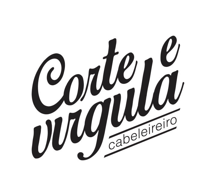
"corte e virgula" is a hair saloon and means "cutting and comma" or something like that... simple with no symbol, withe and black

 Partnered with Clios.com | Ads of the World
Terms of Use | Privacy Policy | Cookie Policy
© 2021 Clio Awards LLC.
Partnered with Clios.com | Ads of the World
Terms of Use | Privacy Policy | Cookie Policy
© 2021 Clio Awards LLC.
2 Comments
Without a dot on the "i", it made the third word a bit hard to read. Also, with a cursive font, shouldn't all of the letters be connected as it would in handwriting?
I'm not at all sold on the font you used for "cabeleireiro." It looks very cheap and generic compared to the elegant look of the rest of the logo. I'd choose something a bit more interesting, and perhaps have it go across the entire word.
i have to thumb down the typo because caballero is so badly done . kerning issues , align issues, and so on. Virgula is hard to read , the missing dot is a pain in the a#$#..