handcross
Anonymous (not verified) | Mon, 02/27/2012 - 19:56
Brief from client
For a client with a dark mind ;)
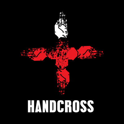
will be used especially for web. everything is custom made except of the font. the pattern i used is also custom made.
what do you think?
12 Comments
I like it.
Your hands are to hard to make out, there is to much of the grunge effect going on.
Also it looks like a pretty basic approach to the logo, I would suggest trying to do a couple more ideas and really play of the hand more the the cross.
very grungy look here. the hands need to stand out more imo. i agree with JoshTMoore
instead of over making the grunge on the hands you should go with a more natural look and compensate with a vintage russian look (that's how it looks like for me). The font is neutral in my vision, go perhaps with something more industrial and geometric, maybe something massive.
"For a client with a dark mind" isn't the best design brief anyone can use to provide an accurate opinion.
For all I, well… WE know, this design could actually work very well for your client.
But from a subjective point of view, this logo isn't hitting the mark for me. As I usually say, I prefer not to vote than down-vote.
It's a bit too grunge for me. The hands aren't really noticeable, you really have to make a mental effort to discern the hands. The top white hand doesn't communicate anything special of specific to me. The cross in the middle doesn't either; it looks like a random shaped figure.
The layout of the mark on top and type below feels too basic. If it's going to be grunge-style, the layout should also carry that concept over.
It looks very satanic... except the type, that's what throws it off.
I think you may need to do more exploration.
BTW, Thanks for the invite :)
Honestly, no offense, I do not like personally. Just a personal opinion.
Thank You
Grungy texture is really distracting. The hands are difficult to identify because they don't have defined edges.
I would make the hands clearer to show your idea better and I don't understand the white hand on top. A bit more work!
I like the stylization of the symbol. But also agree with the designers before me, the grunge style is ok, but maybe you can try couple more variation of it..
I would also add a bit grunge style on the font, to connect it with the symbol.
i think you should grunge-up the font and grunge-down the symbol... if ya know what i mean?
I like the idea but I think you should keep it simple, no grundge effect! ^^
I have to agree with ricardozea on this one - it's a little difficult to grasp how well this logo works for your client based on the design brief. This may mean that some of my comments may not make sense - it would be better if the design brief included a little more information about who your client is or what they do!
But, from a purely graphic point of view, I kind of like this look.
The idea makes sense, "HANDCROSS" -> "HANDS" + "CROSS", and I like that you went the extra step to ensure originality. However, I would be interested to see what sketches or concepts you came up with before settling on this idea as this idea is fairly simple (a play on words vs. actual symbolism).
I also like the use of white at the top of the symbol as it balances with the white text on the bottom of the graphic. Have you played around with other layouts for the logo (such as horizontal placement?) - does the white on the symbol still balance the text? If not, I might suggest moving the location of the white to be more modular. If it does keep its balance in different layouts then good work - keep it as it is!
Although the grunge look seems appealing in this usage, I would caution using it in the standard version of this logo. That pattern may be difficult to reproduce at smaller sizes and currently the effect does take away from the hands quite a bit. As it stands now, I can easily see this logo working on a t-shirt or hooded jacket, but I'm having trouble seeing it on a business card, or on a television commercial, or on a building sign.
Try getting rid of the grunge effect, or at least toning it down, and see if it looks cleaner without it.
Overall, nice job! The text matches the style of the symbol and the use of white seems to nicely balance the logo as a whole. I would just experiment with the balance in different layouts and get rid of the grungy pattern.