hardy hops brewery
darkreixor | Tue, 02/17/2015 - 21:55
Brief from client
local brewery
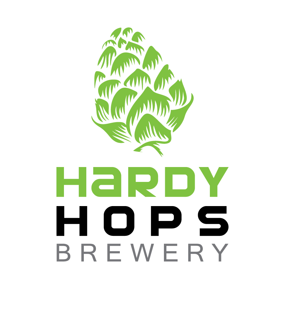
Let me know what you think of this one?
i wonder if the kerning of HOPS isn;t too much? i wanted to match the width of HARDY
local brewery
Let me know what you think of this one?
i wonder if the kerning of HOPS isn;t too much? i wanted to match the width of HARDY
10 Comments
What do you want to POP out first?
Right now my eyes are drawn to HOPS right away and pulls all the attention away from Hardy. Is that what you are going for? Does Hardy Hops have to be on two lines - I'm curious to what it would look like on one line.
Any particular reason for the green? Personally I love green, but when I think of hops, green usually doesn't pop in my head. (But that can also be a good thing).
I dig it. I like the hops icon a lot, great job with that. I think your kerning is fine for HOPS.
My only concern is how tall the logo is. Maybe try reducing the spacing between every line just a bit, and perhaps make the hop just a bit smaller. Overall, great job though.
Like the symbol, hate the type.
I'll just leave this here.
For shame. I believe a redo is in order here.
my customer requested me to use this drawing. he gave me a vector file :$ how do I know if he purchased it ? Crap I'm gonna feel like an idiot asking that, but I so don't want to use something that isn't mine !!
Well, purchased or not it it's not your work, therefore the logo isn't an original design; that's where the problem lies. I would communicate this to the client.
Alright, I can understand that. If a client gave me a vector to work with - which almost never happens - I'd be so thrilled I probably wouldn't go searching for the source.
I see your dilemma with the client, but I think there's a solution. Instead of asking if they purchased the clipart and perhaps sounding like you're accusing them of something, let them know that you came across the same drawing and warn them against using common files like that as part of an image branding project. Clip art is there for people to use as decorative elements in newsletters and birthday party invitations, not as a trademark. A logo should always be original and distinctive. Furthermore, they can't copyright their own logo: downloading clipart from the web only gives certain rights for reproduction but ownership remains with the creator.
If I were you, I'd draw up my own version. and explain why it's better.
Well said
One other question... does the client say "hardy" when they mean "hearty"?
Hardy: able to live through difficult conditions (such as a cold winter or a drought); strong and able to accept difficult or unpleasant conditions
Hearty: abundant, rich, or flavorful enough to satisfy the appetite