Help with my own logo
Jennifer Mulligan | Sun, 06/21/2015 - 09:56
Brief from client
I need to create a logo for my freelance graphic and web design business and we all know how hard it is to design for yourself!! Argh!! I want it to reflect my personality but also be modern and professional at the same time.
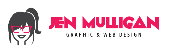
This was my first draft but I'm now not a fan of the font I've used. Anyone have any suggestions for improvement/a different font suggestion?


11 Comments
Here is another version. Lets call this version 2.
Using a different layout and font on this one. Don't think the font for jen is working.
Version 3.
Different layout again with different font.
Hello Jennifer and how are you!? I like font for " Jen " here is the best and if you could tied up a " J " to your pony tail or even replace a pony tail with this " J " - that would be even stronger symbol in my humble opinion. In a symbol here I would keep a hair flock the way it is on an opposite side of a pony tail and remove that tiny line on the other side, as it somehow generates a feeling of a shirt collar, unless, that is what you want? I'm not sure about dark lips? Back to your title - try to combine " Mulligan " from your original take with this one here - I do like some nouveau going in original. Subtext can be shifted under " Mulligan " and be a bit thicker. Great job, good luck!
Version 4.
Not sure on this one. Too much script text?
This one works the best for me. It would even be ok without the symbol. It's simple yet it has personality. Good job.
Thank you for your comments Shawali. Yes, I think this version is growing on me as well. :)
Everyone here has a right for their opinions and that is what we are here for. I do like " Jen " here , because if you look closely you can spot a type of glasses that you're wearing on your photo on a " J " being flipped vertically. That goes well with your personality, isn't that why you made your glasses in pink to stand out more on a symbol? So, more focus when looking at your symbol is on glasses, right? I do feel strange about a pony tail, it seems extra and doesn't really do anything - symbol would be fine without.
Version 5.
I'm with Shawali/Charlie I like version 4. The script and block font combos have too much of a political campaign sign vibe, Version 1 the font is too gimmicky for my tastes and as an art director looking to hire I would wonder if all your work would be as unconventional. Version 5 is also a solid choice, but I think 4 has a whimsy that goes well with your icon. Speaking of which, great job on the icon, clean and simple, no need to muddy it up trying to work in letters or more colors. Again Charlie is correct, both parts of your logo stand on their own well enough, good job. If you feel this truly represents your personal design esthetic, then run with it and best of luck to you.
Thanks for your insight Fred. I was really trying to create something that represents me as a person. I do a lot of varied graphic design work for a wide range of industries so thought that focusing on me instead of trying to put together a logo that covers all industries would be a better way to go. I agree, I am happy with the icon and I don't think I will be adding to it. I was just having problems finding a font/layout that matched. Looks like version 4 is the one. :) Thanks again, I really appreciate you taking the time to leave your comments.
I like the version 4, I see that the font fits perfect.
fine for what you did.