hi to kori bonsai nursery
Gabriel Carvalh... | Fri, 11/09/2018 - 03:00
Brief from client
Company from Australia that sells and takes care of bonsais.
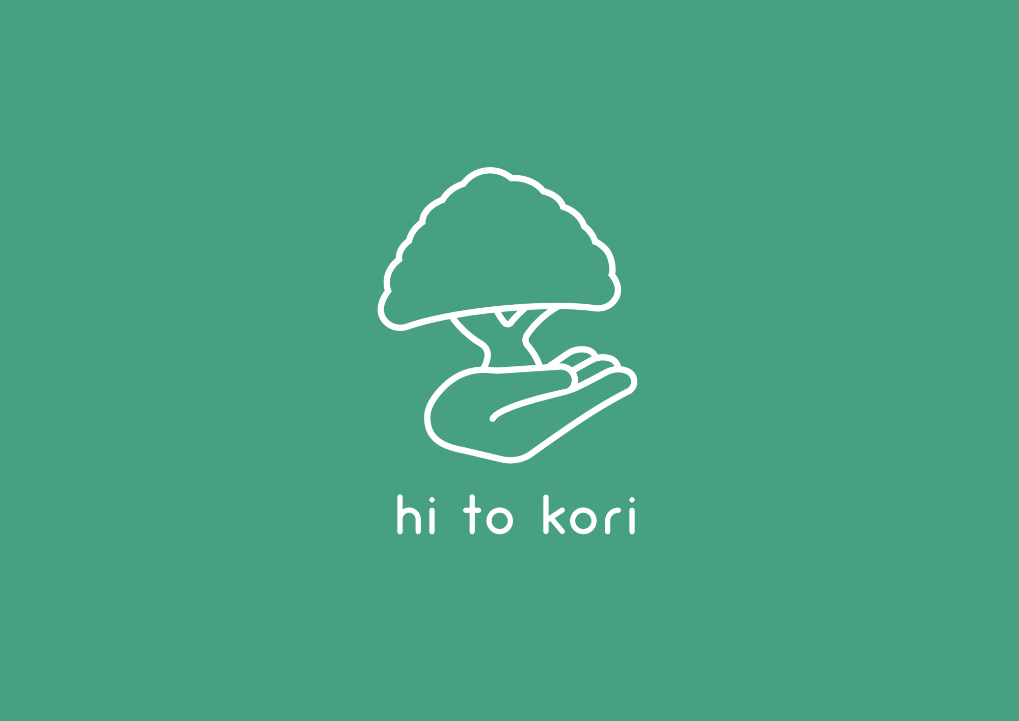
Simple idea of replacing the bonsai's vase with a hand. Font is Arciform.
Company from Australia that sells and takes care of bonsais.
Simple idea of replacing the bonsai's vase with a hand. Font is Arciform.
4 Comments
The idea is ok, but the execution is really underwhelming.
This looks like it's been done in under 5 minutes, without prior thinking or research.
The symbol is tilting on the left, throwing the whole thing off balance. This bonsai looks more like a big mushroom.
Your other posts are proof that you can do way better than this.
You'll probably see a lot of mistakes on my posts until I learn what I can and can't do on logos. After 3 months of learning "alone", I hope it's still ok that I'm making those mistakes. I have a question, though, because my thought process here was to make this logo look natural, so I didn't really worry that much about symmetry. How can I make a logo look natural but balanced? Can't I add branches with unusual curves or stuff like that? Or maybe I'm just confusing the terms here?
I think you are focusing way, WAY too hard on the "rules" of logos.
There is no such thing as hard limits with logos.
You have simple rules: make it marketable. Keep the colors to a minimum. Have consistent branding. have good taste.
But it is up to you, as a designer, to push those limits, and break them in the right ways.
You have this very kawaii, japanese vibe right now. But you need to really, really push this. Go all out, and see what comes of it.
That being said, i love the name, and I actually adore the font choice.