Highway
Joe White | Sun, 01/06/2013 - 14:23
Brief from client
The logo is just to be 'Highway' I just want
a simple wordmark type logo nothing over the top. It needs to match the website so try and use the website for inspiration. Simple is powerful.
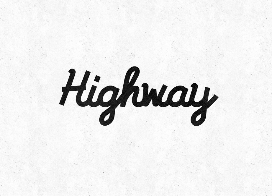
Nice simple Logotype, Custom hand-drawn lettering originally based on Pacifico. I've produced well over 50 variations on this, but this i feel to be the strongest. Be great to know your thoughts, Kerning is something i have trouble with on hand-drawn type. Any suggestions are welcome.
5 Comments
Linework
I'd be a fool to say that I don't like it. It looks stunning! One thing to think about can probably be putting some street lines in there somehow since the font looks like street pavement. Somehow including a few white dashes somewhere would probably drive it home on the meaning "Highway". Just something to think about :D
Haha, I've already played with the idea. The client originally had a Highway road sign as an icon for his logo. But this time round he wants no reference at all to the 'Road' style highway. Its for a IT business, the its referring the 'Super Highway'
Appreciate the comment, but this will be just a nice clean and crisp logo-type. Will add some extras in along the way though.
Awesome! Okay good I hoped that you ran through that idea lol.
I still worry about what people who aren't familiar with IT or computer in general will make of this logo - But oh well, maybe its not for those type of people XD
nice job but i think the text needs a bit of variation, as in all your lines are the same thickness.. i think making some parts of the letters slightly thinner than others will allow it to flow a little better