Hockey Mania
JorgeMenaTr | Fri, 06/03/2016 - 18:25
Brief from client
I was completely free to do whatever I wanted with the logo, which was cool.
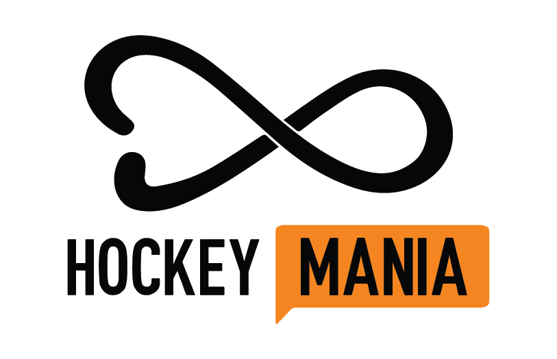
This is the first Field Hockey Store in my city and I was very excited to make the identity for it. I was going for something casual and that it included a stick. I'm not a personal fan of the infinites but I think it felt quite well. What do you guys think?
5 Comments
I thought that two cobras were having a fight at first. Sorry, I didn't acknowledge two field hockey sticks before reading your description. Symbol needs more work in order to instantly point to a field hockey.
I don't even remotely see a field hockey stick, not even a regular stick. Sorry.
I don't see the stick reference either?!?! Seems like this sort of business would want a "tougher" looking logo- just my thought.
Update: I see it now, but it is pretty abstract.
Need some grass?
I say that because field hockey is not a big thing here,
ice hockey is. If you don't have ice hokey or if it is less popular,
I find that logo adequate. I would work the right side of the curve,
I would try to keep it more "stick" look by not making it bolder than the bottom of the Hockey sticks.