Hometown Pressure Washing
ErinsSonicYouth | Tue, 11/21/2017 - 21:11
Brief from client
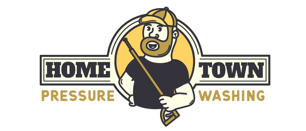
Startup for a pressure washing company. This guy really likes characters, so I made him a cartoon.
Startup for a pressure washing company. This guy really likes characters, so I made him a cartoon.
7 Comments
This is cool. I love that the type is substantial- works great with the quirky guy! I would move his washing thingy (lol?) inside the circle, since the rest of him breaks out of it. And his left arm looks a little weird- like there is a line missing to distinguish the forearm.
Otherwise, good job!
Great Job! it all looks good to me except I don't like how the end of the washer finishes so close to the circle border. There needs to either be a bigger space there (making the washer shorter) or the washer needs to be made longer to go over it the border substantially. At the moment its a tension point in the design.
Really like the overall appearance though! :)
I'm a fan of mascots when appropriate and it works here, In addition to the suggestions above, you might want to revisit the size relationship between the symbol and the type or come up with an alternative for different size prints. For example this is good for say a truck door or bus bench ad, but the text would be awfully small on a business card or receipt. Equally so at a billboard size the character may overpower the text.
And just to complicate things HOMETOWN is usually one word, but not always, just more often than not.
This looks cool!
That symbol could use some more work though. This little guy's arms look a bit weird. I would put him inside the inner circle, with only his head and left arm popping over.
Also, the main stroke of the circle looks a tad less thick than the rectangular frame.
This is looking good so far! Keep it up!
While I like this, I am having a bit of trouble with the "O" face. If it were me, I would do a mustache rather than a mouth. If you were to take the beard away, the lips are on the bottom of his chin. I know this is a mascot, but my eyes keep getting drawn to the mouth. But this is all just me.
This is really awesome but do you think you can change the color scheme to blue/green to match the website? I really appreciate your help. I am not good with graphics and I am learning the hard way what you can and can't do in the graphics arts world when it comes to logs. I thought by purchasing the guy in the logo Eric showed you today from Shutterstock, we were good but apparently not :( The guy you designed actually looks a lot like Eric!! He likes things bright and colorful so I'd hate to have to change the website to brown. Thanks so much!!
Hey ErinsSonicYouth is there any way that i can get in contact with you? iIwould like a similar logo like this for my startup.