Hotel Ramiro II
pacoxo | Thu, 02/02/2012 - 14:20
Brief from client
Monastery Hotel in Benasque (north of Aragón, Spain)
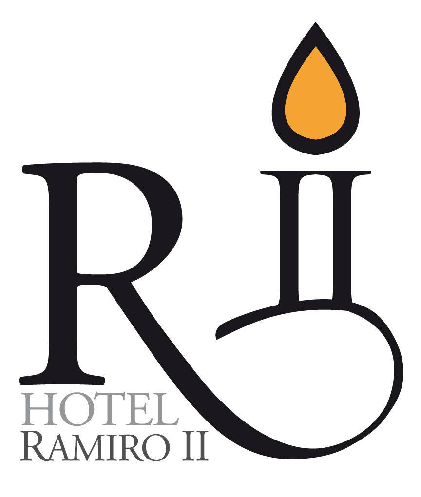
This logo is for a Monastery Hotel named Ramiro II (an old king of Aragon Kingdom, known as "The Monk"). The design is thought with the R of Ramiro and "II", for second. But it seems also a candle, symbol of relax and peace.
10 Comments
It doesn't say "R2". It says an "R" is holding a candle.
Maybe a single "I" would look like a candle but not "II". Besides, the "II" and the "R" are too separated, they look like different things.
I also see a R holding a candle. Not working.
i agree with both luenib and splash, I too see a R holding a candle.
R + Candle... Sorry :.
Who the hell you think you are? I can see good logo projects where you simply can´t see nothing...(?) What's wrong with you? Are you a f***** diva design?
Don't make me laugh (ha-ha). If you are so good be a man and publish some of your "masters pieces". Clown! Ha ha.
Until I saw the R+Candle comments, It seemed perfectly fine. Since seeing them, it has ruined my perception. Regardless, thumbs up.
So, the main problem is that the "R" and the "II" are too separated, right? Well, ok, I see it know, I'll try to bring the "II/candle" closer. Thanks!
That's part of the problem, the other part is...
--Maybe a single "I" would look like a candle but not "II".--
That means that you are using two "I" to make the edges of the candle, not the body
But the name of the king is Ramiro II. It has to be "II", no just "I"
Exactly. What I'm saying is that you are forcing the candle inside the "II" and that's what I don't like about the idea. With "Ramiro I" would have worked, but what about "Ramiro V"? "Ramiro III" would look like a birthday cake.
What works for "A" not necessarily works for "a" even when those symbols represent the same thing.