I.D.E.A
rayyadiel | Tue, 01/07/2014 - 16:33
Brief from client
I.d.e.a stands for individuals dedicated to excellence and achievement. It is for a skateboarding brand. He wanted the lightbulb and brain incorporated together.
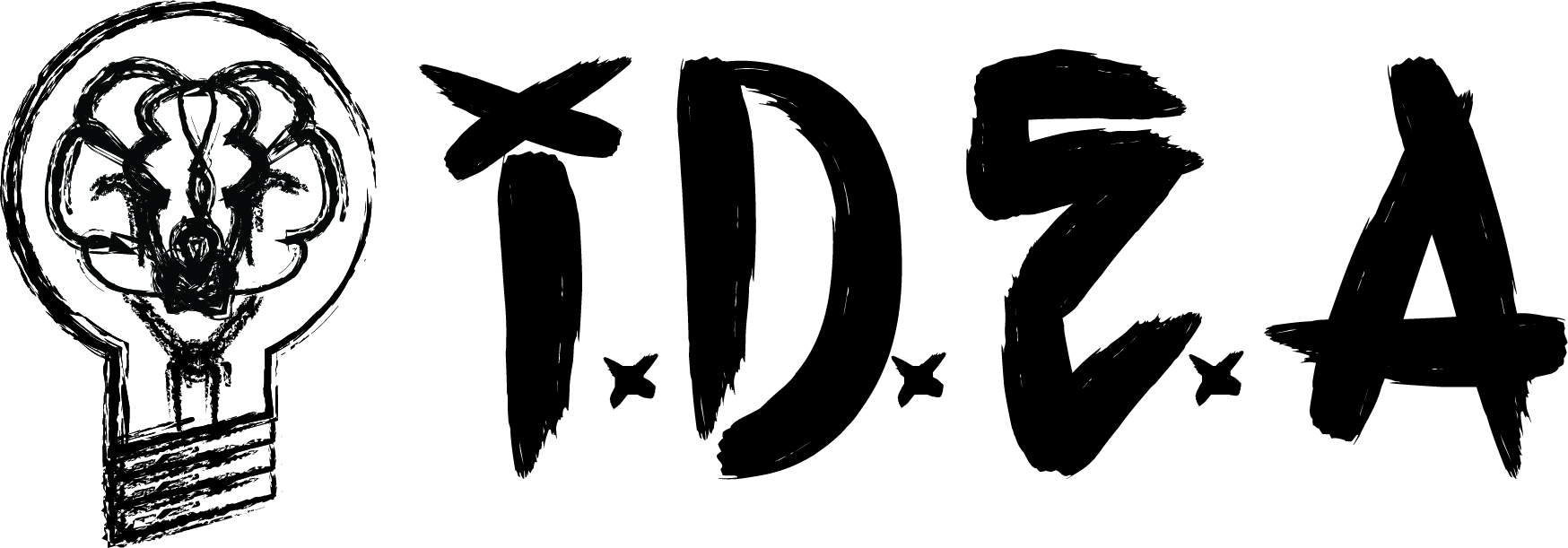
I am at a stand still with this logo, the client said he wants it to be grittier. When I asked him to explain his definition of gritty he said "less straight." Still have not introduced color into it. Would like some feedback. Thank You.


4 Comments
I see two problems here.
First, it looks like there are two different logos. The hand made lettering is really cool and is kinda too strong on its own to support a symbol.
Speaking of which, this symbol has to go!! Mainly because the lamp bulb is an super old idea which has been done to death. But also because it really shows you used a Illustrator brush preset, which makes it look really amateurish.
I'd really just keep the I.D.E.A part and you'll have a nice word mark.
Thanks for the critique. And I can agree with everything you have said.
Shawali is spot on, as usual. As for color, I think it'd look great if it was just white letters on a black background.
Kind of like this logo: http://i300.photobucket.com/albums/nn26/WeaZel34/GojiraLogo.jpg
I agree with the two comments. When I think of skateboards, I think of crazy graphics on the bottom, so it might actually be in your favor to keep it simple with black and white, as not to take away from a graphic on the underside of the skateboard. It would stand strongly on it's own.
My only critique of the mark is to watch some of the spacing of your letters and x's. I would just bring the second x (to the right of the D) to the right slightly so it doesn't bleed into the letter. When downsizing this logo, you might have some issues there when it comes to print.