Identity Project (Logo for myself)
Kayla Roxanne | Tue, 02/28/2012 - 19:55
Brief from client
This is a design for my own logo. I wanted to keep it very simple, clean and sleek. If you have a terrible logo you are probably a terrible designer so I want to avoid a bad logo. Please be gentle but give me some real feedback on which version is better or if they both stink. Thanks! I appreciate it!
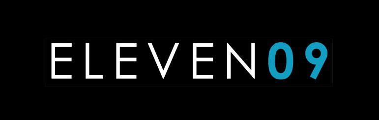
This is a design for my own logo. I wanted to keep it very simple, clean and sleek. If you have a terrible logo you are probably a terrible designer so I want to avoid a bad logo. Please be gentle but give me some real feedback on which version is better or if they both stink. Thanks! I appreciate it!
5 Comments
please submit each version individually so that we can judge it better.
I did it for him. I agree. Only one logo per page.
I only wanted this and the other one that has three lines for the e's. I don't know how to delete the other ones. Any feedback on this one?
It's better.
it's not bad. but i think it could be better.