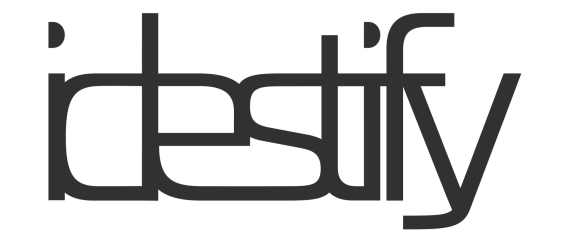
idestify
idestify | Sat, 12/05/2015 - 12:41
Brief from client
personal branding

This is a header logo for a website I'm making for myself. I'm an experimental web and graphic designer. I'm inspired most by Dadaism, International Style, computer generated design. I often experiment with expressive typography, photography. I was going for a streamline yet expressive quality logo. A happy mix between the illegible expressiveness of old Dada design and modern design.
Color is undecided at this time.


7 Comments
No. Squeezing characters so close together is very gimmicky and makes the whole thing unreadable.
Sketch a few hundred ideas before committing to anything on the computer.
It's supposed to be semi illegible, I Think I mentioned that in my OP, I posted a response to the comment underneath of yours speaking more about what I'm going for.
This just gives me a headache trying to read it. Playing with Dadaism is ok, but right now the right side is sooooo cramped and the left has some big open spaces in the letters, so the whole thing as a composition (forgetting that it's a word and thinking of it just as an image) is just really imbalanced.
I don't want you to read it so much, it's supposed to be more of a form made from my "name" so the critique on composition is really helpful, thank you! Do you think it would look a little cleaner if I overlapped the characters with large pieces of negative space so that it breaks it up and pushes it more to the "form" instead of "word" side of type?
The point is literally that it shouldn't be easy to read, so maybe I should push it even further to that point?
Also I should add that on my website, this is accompanied by my real name so it really does work as more of a symbol.
Maybe there is a happy medium between completely illegible just for the sake of style, and legible for the sake of ... well... legibility. I know what you are trying to do, but it is working against you.
This is hard to read, which means as humans - we will not read it. You get one re-try from a person of 'Oh, I can read this, let me try again'. They will then try for a second to figure it out, but if they can't after that one re-try, they are not going to try again. Then they move on, and ignore you. It also doesn't help that they are trying to figure out a word that isn't a word they have read before.
Even if the point is that this is supposed to be illegible, people will turn away from it because it is frustrating, and we dislike frustrating things. It is the opposite of what you want, because it will turn people away and not keep them intrigued. (This would work in a word puzzle book or something though)
I do like how they 'e' and the 's' go together. That is a nice shape. Perhaps try just making a few letters close together like those, but let us read the logo at the same time.
As long as you put letters together to form up a word, people WILL read it. Have you ever tried to look at a word WITHOUT reading it?
And reading a word with a negative tracking is a bitch (I is difficult to identify, the closed up negative space gets in the way...). And frankly, it defeats the whole purpose of logo design, which should be quick to get and leave a lasting impression. Unfortunately, your logo fails on both fronts.
Also, sorry to be a bit blunt, it feels like you didn't spend too much time working on this and didn't really apply a solid creative process which include research, inspiration and a shit load of analog sketching (ie no computer)
I hope this doesn't come across as bitter, but I dislike when people use dadaism/avant garde as a pillar to support their reasoning behind design choices when they don't appear to work. You WANT a logo to be readable.