Brands of the World is the largest free library of downloadable vector logos, and a logo critique community. Search and download vector logos in AI, EPS, PDF, SVG, and CDR formats. If you have a logo that is not yet present in the library, we urge you to upload it. Thank you for your participation.
Version history
Version 1

- I
- S
- T
- C


11 Comments
The brand name made me giggle.
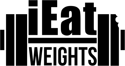
And while the idea behind this logo is really cool, the end result fails to deliver. Mainly because Impact, simplistic shapes and no sketching beforehand.
Keep working on it, because this idea calls for a greater logo!
Good concept, but too simple. Typical fonts & too many straight lines makes for a boring, and non-eye catching logo.
Ideia já utilizada em demasia. Tipografia de difícil leitura e ausência de cores.
Try to stick to English, please, so everyone can enjoy the conversation. Especially since the OP doesn't seem to be a native spanish speaker.
Good idea here! It has potential, work on it and this could be awesome
Thanks for the input! could you please specify what your opinion on the symbol and type are?
The font's need to be changed, A font with impact that still looks nice is what you need, just have a look around and see what there is. In terms of the weights illustration its a bit too....raw, work into it. the whole thing needs to be eye catching whereas at the moment it looks slightly dull.
Keep at it! Its a good idea but so far thats all it looks like...an idea, it needs to materialize!
Oh and make that bite mark more obvious you can hardly notice it
The font for "iEat" is Impact one of the most ubiquitous, overused and boring font ever. Every logo which include it is marker by the seal of the ultimate amateurism. Plus, it doesn't really compliment the font for weight, which is good.
Try to harmonize the two fonts. Remember some basic type matching rules, like a nice cursive fits pretty well with a bold condensed sans serif, etc... Think contrast.
About the symbol, the idea is here, but the end result is too simplistic, not to be confused with simple. It's just an aggregation of rectangles, and the bite mark is really underwhelming.
Hope it helps.
Thank you all very much for the critique and advice, I really appreciate it. I do agree with the comments and suggested adjustments to the logo. I am actually not the designer of the logo, I would like to ask where would you suggest I go to hire a great graphic designer to do a re-design for me?
You got to a place full of designers! I think you can check who listed themselves as part-time or freelancers.