Brands of the World is the largest free library of downloadable vector logos, and a logo critique community. Search and download vector logos in AI, EPS, PDF, SVG, and CDR formats. If you have a logo that is not yet present in the library, we urge you to upload it. Thank you for your participation.
Version history
Version 1

- I
- S
- T
- C


4 Comments
Ok. First, this is not a serif font but a non serif font.
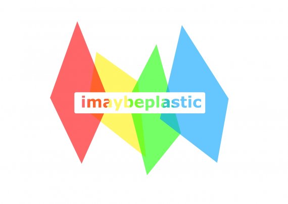
Second, it's unreadable. Transparent text on different colored background, let alone on bright colors like yellow will do just that.
If you want to experiment, start with sketching first. Use the computer only as an execution tool.
I must say that I like the phrase "I may be plastic" =)
Good luck.
Yeah, sorry but this logo not work in all
Is unreadable, and this is the first and principal problem how you can love a brand if can't read your name?
And don copy Apple Inc. Al the beginer designers copy apple and this is why have so many pages what looks like apple.
Good Luck and sorry for my bad english
The only sans serif I have a pet peeve about is Tahoma. There are so many other more consistent typefaces out there, Tahoma always looks slapped together for me...
I agree with the two comments before mine. Also, overlapping the colors could cause printing issues down the road, especially on a dark background.
So the logo is not unsalvageable. I would first take the text and reverse it out so that the letters are filled rather than the space around them, then I would Tamper with the colors a little to make the text so that it is readable.
I think the concept and the colors are interesting, but now you need to relate them to your name. It's a cool name but I would like to see it better represented visually.