Brands of the World is the largest free library of downloadable vector logos, and a logo critique community. Search and download vector logos in AI, EPS, PDF, SVG, and CDR formats. If you have a logo that is not yet present in the library, we urge you to upload it. Thank you for your participation.
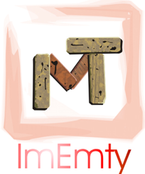
The main graphic is messy and too complicated (try flattening it to a single colour) and the border makes it look messier. It might work better if you simplify it?
The text is not in a great typeface and isn't improved by the gradient.Try putting it into Helvetica, one colour and losing 'Web 0.1 Beta' capitalisation.
Agree with dltd in all the points/ Using messy colors is risky in logos, especially if you go with pastels like that, in this case is a failure. Use solid colors, MT looks bad , remove gradiend in the typeface.
Yea there's some potential here but it needs some cleaning up,
loose all the colors the best logos are simplistic let the logo speak for itself instead of trying to use so many styles to try to capture the audience attention!
4 Comments
I won't pretend to like it...
The main graphic is messy and too complicated (try flattening it to a single colour) and the border makes it look messier. It might work better if you simplify it?
The text is not in a great typeface and isn't improved by the gradient.Try putting it into Helvetica, one colour and losing 'Web 0.1 Beta' capitalisation.
Agree with dltd in all the points/ Using messy colors is risky in logos, especially if you go with pastels like that, in this case is a failure. Use solid colors, MT looks bad , remove gradiend in the typeface.
Yea there's some potential here but it needs some cleaning up,
loose all the colors the best logos are simplistic let the logo speak for itself instead of trying to use so many styles to try to capture the audience attention!
I don't understand the textures or image elements.