Brands of the World is the largest free library of downloadable vector logos, and a logo critique community. Search and download vector logos in AI, EPS, PDF, SVG, and CDR formats. If you have a logo that is not yet present in the library, we urge you to upload it. Thank you for your participation.
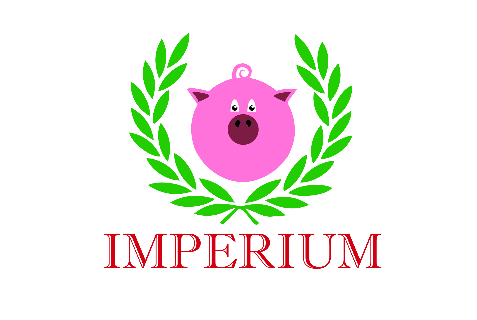
Designing for a food company can be very intense. Particularly because what you are trying to do is appeal both the eye and the appetite. While this is a good direction, there are still some basic graphic design elements to work on. I would normally tell you to start over from scratch with another iteration, but with what you have the first submission you sent was a lot stronger. Here's why:
-I like the symbol you have here as a good starting point, but I'm 199% certain that you can come up with a better one. Right now your pig looks a bit too cartoonish for what you're going for. Some famous logos that use pigs are Boar's Head, Piggly Wiggly, etc. but even better is this link that has some examples of nice looking pigs logos (I recommend you take a look at smart piggy especially - one of my faves!)
-Your type, while very "imperial," simply has to change. Right now it looks way too dated for use in your logo. Search for "Haggin" and use that, or something similar to it if you want to use a serif font. In most cases, slab serifs are always a safe choice when talking about meat in my opinion.
-Your colors are bright, but a bit too bright. You can probably get away with a muted red or something warm, Also try to stick with only using 2-3 colors in the entire piece, including the back and whites. You have pink, green, red, white, and black as of now, so imagine trying to pay for print for 100 logos with such a huge palette. As I said, a consistent red or warm color through the piece would probably be less jarring - among using pantone colors instead of rgb :-)
While this is alot to work on, it still can be revised if you're willing to give it a shot. Otherwise it may be best to start from scratch after taking a look at those examples I gave you :D
Thanks for the help, I'm still kinda new into this so I'm having a little bit of problems.
I've been sketching some ideas gonna make some few changes with the help you gave me and later I will upload a new version to see how it goes.'
2 Comments
Designing for a food company can be very intense. Particularly because what you are trying to do is appeal both the eye and the appetite. While this is a good direction, there are still some basic graphic design elements to work on. I would normally tell you to start over from scratch with another iteration, but with what you have the first submission you sent was a lot stronger. Here's why:
-I like the symbol you have here as a good starting point, but I'm 199% certain that you can come up with a better one. Right now your pig looks a bit too cartoonish for what you're going for. Some famous logos that use pigs are Boar's Head, Piggly Wiggly, etc. but even better is this link that has some examples of nice looking pigs logos (I recommend you take a look at smart piggy especially - one of my faves!)
http://naldzgraphics.net/inspirations/cute-pig-logo-designs/
-Your type, while very "imperial," simply has to change. Right now it looks way too dated for use in your logo. Search for "Haggin" and use that, or something similar to it if you want to use a serif font. In most cases, slab serifs are always a safe choice when talking about meat in my opinion.
-Your colors are bright, but a bit too bright. You can probably get away with a muted red or something warm, Also try to stick with only using 2-3 colors in the entire piece, including the back and whites. You have pink, green, red, white, and black as of now, so imagine trying to pay for print for 100 logos with such a huge palette. As I said, a consistent red or warm color through the piece would probably be less jarring - among using pantone colors instead of rgb :-)
While this is alot to work on, it still can be revised if you're willing to give it a shot. Otherwise it may be best to start from scratch after taking a look at those examples I gave you :D
Hope this helps!
Thanks for the help, I'm still kinda new into this so I'm having a little bit of problems.
I've been sketching some ideas gonna make some few changes with the help you gave me and later I will upload a new version to see how it goes.'