infinim
martin_mre | Sun, 05/31/2015 - 19:48
Brief from client
Logo for a photography studio
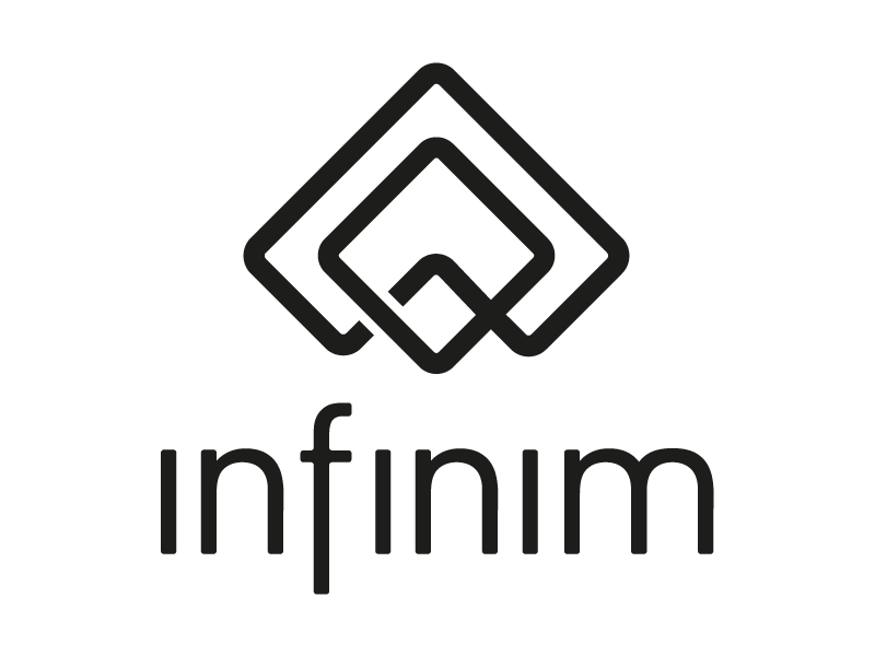
I change to lowercase i think it gives a better connection with the symbol and also conect one of the side to give also the infinite sensation.
8 Comments
This is a pretty major improvement from the previous versions.
I really like what you did with the word mark.
Now the symbol is cool but I'm not really feeling that unsymmetrical thing you did with the shape criss-crossing on the right and not on the left. It's a bit disruptive, but not in a good way.
Beside that, good work, keep it up!
The reason to make it unsymmetrical was to make it look more like infinite, dont have that feeling where it begans and ends.
A big jump forward in the Typography. I like this - a lot. I am agreeing with the smoking skull though, as I often do, in that the symbol took a slight step back. The last version was one of the few times I liked a gradient in a logo, and I liked the overlapping from the previous version.
I don't know if I'm the only one here to see an abstract silhouette of Australia in a symbol? I agree with Waffles to look back at a symbol on version two and try to create that overlapping infinity effect that this one is lacking for sure. I'm not sold on a choice of colors either.
I say that if you cut the right side and the left gives more equal and there'd be putting the law of completion, it is a good logo.
If you want to keep the infinity look idea then I suggest making the one on the right do the opposite overlap. :)
I didnt understood, are you saying a mirror of it?
Words are hard sometimes.
Here is a picture of the idea anyways. May or may not work out.