Brands of the World is the largest free library of downloadable vector logos, and a logo critique community. Search and download vector logos in AI, EPS, PDF, SVG, and CDR formats. If you have a logo that is not yet present in the library, we urge you to upload it. Thank you for your participation.
Version history
Version 1

- I
- S
- T
- C


7 Comments
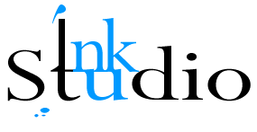
Sorry, but i thing its a little confused. You can play a little with an ink spot... try to start again. And maybe a stronger color.
I agree with geracao..... the ink spot doesn't look natural enough. Also, the "I" and "t" tie in doesn't work well. You may want to consider tying other letters or separating both words altogether. Really, if this is supposed to denote creativity, there isn't anything creative about this logo at all.
I don't understand the idea and it's confusing overall. Start over!
Joining the 'I' with the 't doesn't really work. 'When I read it I see' nk Sludio'. I also see 'nku' highlighted in light blue for no reason. It all detracts from the logo and what it is supposed to enhance. I like the ink splash idea but it could be a bit more messy. Needs a reworking.
I don't like the ligature of the I and the t. What are you trying to say with this logo? Ink denotes something handwritten or hand-drawn ... try doing that!
i think this was over-thought. start fresh. scratch this.
I would do the Ink in one color, and the Studio in another.The joining really doesnt work good.