Brands of the World is the largest free library of downloadable vector logos, and a logo critique community. Search and download vector logos in AI, EPS, PDF, SVG, and CDR formats. If you have a logo that is not yet present in the library, we urge you to upload it. Thank you for your participation.
Version history
Version 1

- I
- S
- T
- C


2 Comments
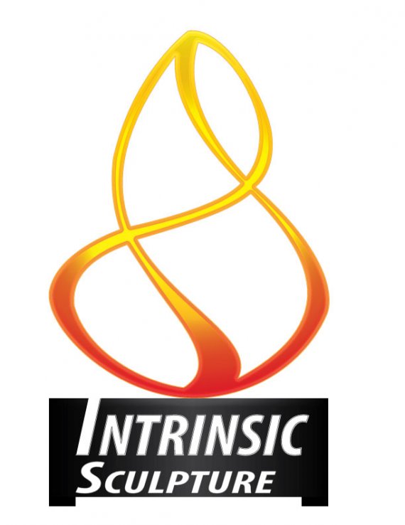
I like the shape of this. Generally speaking, I wouldn't design with a gradient. What concerns me about this gradient, is the heavy line around it. It is distracting. Where the intersections are, it should show that this piece has dimension, but because the intersections are all open, it reads as flat. I am not a fan of the font. there are some great fonts out there, this doesn't really fit with the flowing sculpture. Also, I would lose the gray stroke on Intrinsic. As for sculpture, either center it, or make it all caps and track it to the width of Intrinsic. Back to the symbol, take a look at some of the logos that have built in dimension. Then look at this one and decide what is foreground, what is background and how can you distinguish between the two.
This does have a lot of potential. Clean it up by making the symbol one flat shape, though. Don't make gradients and strokes, it loses its appeal that way.
Also, explore different font options, but lose the odd black rectangle with a section missing below it. Text boxes are poor practice, and it makes it look very dated.