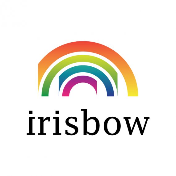
irisbow's logo - design company
Brief from client
Hi, I'm Diogo José Nogueira, and i'm the owner of this company and the designer of this logo. Before imagine this logo, i had the idea to build my own company of design, but i didn't had a clue about the name or about the logo, but i was sure of one thing, i wanted a name that transmit a good visual feeling, and one day, i was on Gare do Oriente, in Lisbon, Portugal, and i was sited and thinking about this, and i've already had the idea of "visual orgasm", but i was afraid that it would be very provocative for some people, so i looked up and i saw the rainbow! that was it! a visual phenomenon that everybody likes to see. And the reason to be "irisbow" and not "rainbow", first that was already a plenty of companies with this name, and second, in Portugal (bow=arco, rain=chuva, iris=iris) we don't say "arco da chuva" we say "arco-iris". Thank you for the interest on this story, the story of irisbow!


11 Comments
I like the typeface although it doesn't seem to gel with the actual logo itself. On the actual logo mark i believe it should be altered a bit as it doesn't look very rememberable of eye appealing.
I agree the actual rainbow cutting off needs to be re-worked. I think you are heading in the right direction though. I love the gradients you used. Sketch out 50 or so thumbnails and see what you can come up with.
OK, it's not rainbow but a bunch of half-circles posing as rainbow icon.
Why are some of the half-circles crippled on one side totally escapes me, was I supposed to see something in there? Sorry but I don't see anything except badly executed rainbow icon.
Typography could work but you mirrored the first 'i' creating a total misbalance in letter pairs kerning and spacing.
Your whole composition is 'off' and it really does not look very pleasing.
I would suggest you re-think this concept and try a different approach.
Your idea of having a visually pleasing symbol is good, but this is not it.
The arcoiris is is overused. Yours is missing pieces for some odd reason. So it just looks butchered which is not visually pleasing.
The font is good, but the flipping of the "i" ruins it.
The colors work for a rainbow.. but since the arcoiris isn't working, nor do the colors. Try to keep to just a few colors for a logo. The more simple the better.
Sorry, but I am not a fan of your logo.
If you were to find a unique use of the rainbow it might work. But, it is over used as a graphic mark.
I like the colors and the type. I also like that you want to do something unique with the rainbow, but it's not yet working. It looks broken not cool.
thank you for the comment. you really made a good understanding of my point of view, have an idea how i could turn this logo more dynamic?
it could work if you polish it more...
Zig-zag cropping the arcs of this four-color rainbow is not helping at all.
Full rainbows have 7 colors. The name of your business has 7 letters. What can you do with that?
those colors are all there, one thing i certified was to put all the colors of the rainbow and in the exact order, and i've already tryed to go on that direction you say, i used each color in each letter, but i personally didn't like. i think that was what you were suggesting. thank you for the critique!
Oh, sorry I don't see the 7 colors.
Using a color on each letter is an example I was going to tell you not to do (but I didn't because I'm lazy). What I wanted to see is a dot, a square, or a ribbon under each letter. The shape depends on the spacing you give to the letters
what about something along these lines?