Brands of the World is the largest free library of downloadable vector logos, and a logo critique community. Search and download vector logos in AI, EPS, PDF, SVG, and CDR formats. If you have a logo that is not yet present in the library, we urge you to upload it. Thank you for your participation.
Version history
Version 1

- I
- S
- T
- C


5 Comments
Is it possible to make the center shape more of a horse head shape?
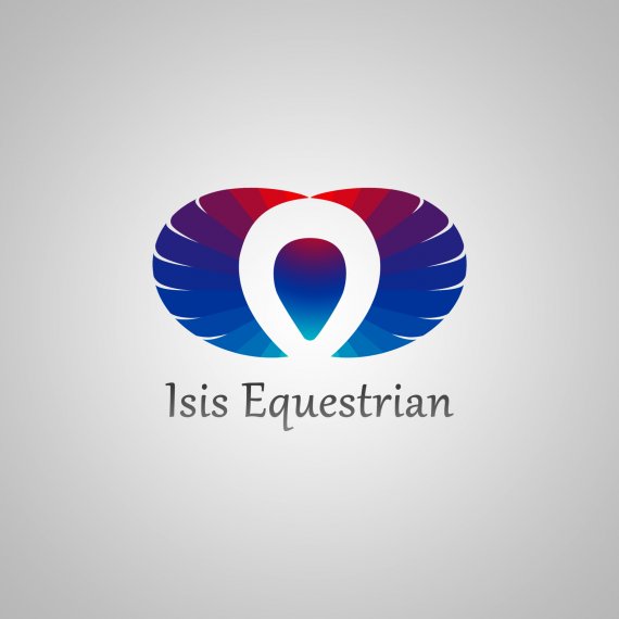
Hmm..... I'm torn here. The colors are a beautiful combination, that's for sure- but printing all of these colors is sure to be a pain in the butt OR expensive, depending on whether you go digital or press. (Especially the gradient in the middle of the ankh.) Is it possible to cut down on the number of them used in your logo??
Secondly, I'm not seeing much of an ankh here. I see the top loop clearly enough, but if I didn't know that I was looking for one, I wouldn't think that's what it was at all.
Are you trying to portray Isis' wings in the striped shapes on either side of the circle? That's the only thing I can think of that feel like Isis to me- and again, if I didn't know what I was looking for, I wouldn't have thought that at all.
I guess I'm just not sure what this logo is for or what it's trying to be. When I first looked at it, before I read the brief- I just saw a smushed apple shape with an oblong white circle in front. I think it's missing something or just needs some big change.
Also, I guess I'm not a huge fan of the font. It's not terrible or anything, but I'd maybe try a stronger, sans serifed one.
I might contemplate starting over (don't hate me!) and look for a more cohesive idea- something that really speaks Isis and/or an ankh without having to tell the viewer that they're supposed to be there, you know?
In any case, it's a heck of a lot better first draft than a lot of the ones we see here! I'd be excited to see new/different versions if you choose to keep uploading them- please do!
Thanks so much for taking the time to give me so much input. I will take another swing at this in the next day and post again.
As Sara mentioned, the problem here is "cohesive". It is a lot of interesting ideas, that don't work together or are incomplete. If you want an ankh, use one, but not half of one.
Thanks! Between you and Sara I have a much better idea of where to try to make this work and what to try next.