Brands of the World is the largest free library of downloadable vector logos, and a logo critique community. Search and download vector logos in AI, EPS, PDF, SVG, and CDR formats. If you have a logo that is not yet present in the library, we urge you to upload it. Thank you for your participation.
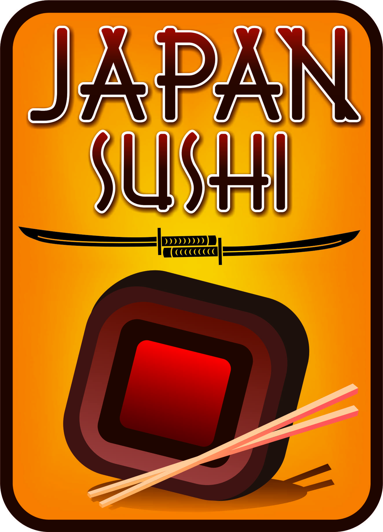
Yo te recomendaría que cuidaras un poco más la forma de la sombra debajo del rollito y no se si dejarle algo de blanco, se ve un poco extraño que todo el rollo sea de colores rojizos, como si el arroz estuviera pintado o algo, tal vez estás haciendo referencia al sol naciente, el círculo rojo de la bandera de Japón, pero recuerda que ese círculo está sobre un fondo blanco por lo cual no creo que afecte la idea si le agregas un poco de blanco, ya que esto le daría un poco de luz a tu logo.
Otro aspecto a considerar es el fondo pues también contribuye a obscurecer la imagen en general , y si realmente es necesario tenerlo delimitado por el margen. Piensalo, en general pienso que va bien, pero todavía se puede trabajar mucho.
Can this get anymore cliché? I guess you didn't have a choice about the name (it's as stupid as "USA Hamburger")
But why the katanas? Just because it says "Japan" in the name? A bit too much of a stereotype, don't you think?
The symbol doesn't really look like a sushi. More like a candy or a a brownie.
The font choice is good though, I like this type. And I don't mind the colors, though I don't personally associate Japanese food with such hot shades.
But it globally feels like you didn't make any sketched before using the computer and that you relied too heavily on what the software permits you to do. Which shouldn't be the case.
3 Comments
JapanSuhi is a new logotype from japan food
Yo te recomendaría que cuidaras un poco más la forma de la sombra debajo del rollito y no se si dejarle algo de blanco, se ve un poco extraño que todo el rollo sea de colores rojizos, como si el arroz estuviera pintado o algo, tal vez estás haciendo referencia al sol naciente, el círculo rojo de la bandera de Japón, pero recuerda que ese círculo está sobre un fondo blanco por lo cual no creo que afecte la idea si le agregas un poco de blanco, ya que esto le daría un poco de luz a tu logo.
Otro aspecto a considerar es el fondo pues también contribuye a obscurecer la imagen en general , y si realmente es necesario tenerlo delimitado por el margen. Piensalo, en general pienso que va bien, pero todavía se puede trabajar mucho.
Can this get anymore cliché? I guess you didn't have a choice about the name (it's as stupid as "USA Hamburger")
But why the katanas? Just because it says "Japan" in the name? A bit too much of a stereotype, don't you think?
The symbol doesn't really look like a sushi. More like a candy or a a brownie.
The font choice is good though, I like this type. And I don't mind the colors, though I don't personally associate Japanese food with such hot shades.
But it globally feels like you didn't make any sketched before using the computer and that you relied too heavily on what the software permits you to do. Which shouldn't be the case.
Good lcuk!