Brands of the World is the largest free library of downloadable vector logos, and a logo critique community. Search and download vector logos in AI, EPS, PDF, SVG, and CDR formats. If you have a logo that is not yet present in the library, we urge you to upload it. Thank you for your participation.
Definitely, the other one just looked like he was a big fan of Adidas. Is the full name of the business just 'Jean Miro'? Or is it something like 'Jean Miro Roofing and Solar'?
Yes, that could work for a business name purposes.Adidas... ? Interesting comparison - however, the gaps between a center stripe on each side of original Adidas logo is much wider and if you take a look at the last logo that Adidas made - it points to an opposite direction versus mine plus it has an angular shape on top of each stripe.
Fred, you are stated that you're an Art Director- right? I personally was expecting a more detail constructive critique coming from you, as I have noticed what you normally leaves for others in here.
Yes i am and I'd be happy to leave a more detailed critique than i left on version 1. I'm sure everyone would just leave a little more info on your client and what their needs are on your posts and we can jump right in to it. The symbol you have here would worl well for a local business, the contrast between the tiles and the solar panels fits nicly into the J. Personally i'm not a fan of rounded fonts, and as you have it here the name of the busines is incomplete. A logo is part of an overal marketing and branding stratigy. If Jean Miro was a household name thet everybody associated with roofing then it would be fine,but it's not (or is it we don't know). Your branding needs to reflect that. So far idea good, symbol good, type bad. This leaves color, light blue on white is not the most readable color combo. I mentioned before about seeing this on the side of a truck, many small business like this rely on word of mouth advertising, and being able to read a truck with the name on the side whiz by adds a lot to the name recognition among potental customers..so I'd suggest looking for a bolder color choice.
And even though you didn't ask, if I was advising you on a professional level, I'd suggest you work on expanding beyond using initals and letterforms in your symbols.. Yeah thats your interest and all, but if you want to make a career out of this you need to widen the scope of your design or you are in danger of potental clients only seeing you as the initals guy. Hope this helps..
Thank you Fred! I'm very pleased with your comment and you're 100% right about learning to become a professional designer by using all types of tools to be more successful in this business of a graphic industry.
6 Comments
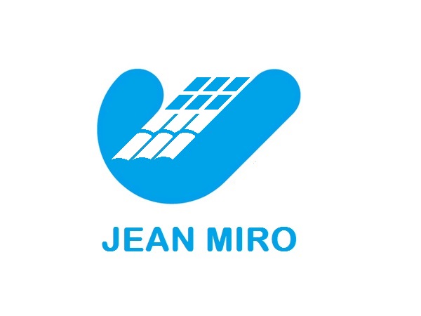
Is this one says more about roofing business?
Definitely, the other one just looked like he was a big fan of Adidas. Is the full name of the business just 'Jean Miro'? Or is it something like 'Jean Miro Roofing and Solar'?
Yes, that could work for a business name purposes.Adidas... ? Interesting comparison - however, the gaps between a center stripe on each side of original Adidas logo is much wider and if you take a look at the last logo that Adidas made - it points to an opposite direction versus mine plus it has an angular shape on top of each stripe.
Fred, you are stated that you're an Art Director- right? I personally was expecting a more detail constructive critique coming from you, as I have noticed what you normally leaves for others in here.
Yes i am and I'd be happy to leave a more detailed critique than i left on version 1. I'm sure everyone would just leave a little more info on your client and what their needs are on your posts and we can jump right in to it. The symbol you have here would worl well for a local business, the contrast between the tiles and the solar panels fits nicly into the J. Personally i'm not a fan of rounded fonts, and as you have it here the name of the busines is incomplete. A logo is part of an overal marketing and branding stratigy. If Jean Miro was a household name thet everybody associated with roofing then it would be fine,but it's not (or is it we don't know). Your branding needs to reflect that. So far idea good, symbol good, type bad. This leaves color, light blue on white is not the most readable color combo. I mentioned before about seeing this on the side of a truck, many small business like this rely on word of mouth advertising, and being able to read a truck with the name on the side whiz by adds a lot to the name recognition among potental customers..so I'd suggest looking for a bolder color choice.
And even though you didn't ask, if I was advising you on a professional level, I'd suggest you work on expanding beyond using initals and letterforms in your symbols.. Yeah thats your interest and all, but if you want to make a career out of this you need to widen the scope of your design or you are in danger of potental clients only seeing you as the initals guy. Hope this helps..
Thank you Fred! I'm very pleased with your comment and you're 100% right about learning to become a professional designer by using all types of tools to be more successful in this business of a graphic industry.