Brands of the World is the largest free library of downloadable vector logos, and a logo critique community. Search and download vector logos in AI, EPS, PDF, SVG, and CDR formats. If you have a logo that is not yet present in the library, we urge you to upload it. Thank you for your participation.
Version history
Version 1

- I
- S
- T No votes yet.
- C


8 Comments
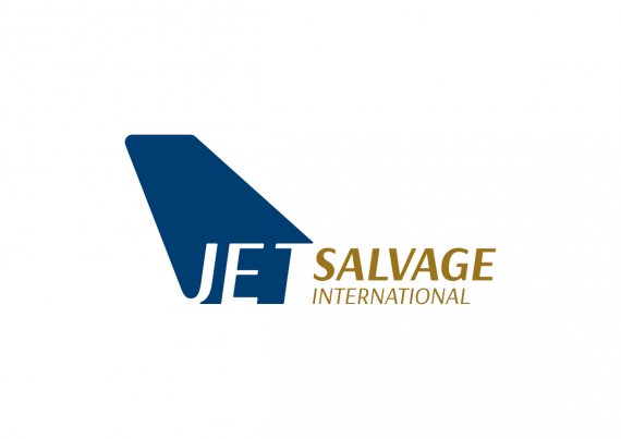
I like the idea but the problem right off the bat is that Jet is just too hard to read. I think the tail fin is too large in relation to the text as well. Keep playing. It's not a bad concept.
what do you think like this
I think the word "Jet" is still lost. My suggestion was just at the size of the fin itself rather than the word.
I agree with Jon, it is not easy to read. The idea can work, but you need to find a way to make JET reads easier.
Agreed with the above, adding that the goldish-brownish-greenish color is really unappealing.
were is that? the brownish-greenish!!! w have just 2 colours dark blue and gold
The gold has a green tint to it, especially in the first image you uploaded.
This ind of details can vary from one screen to another. I see the goldish ochre, but some may see it more greenish. It all depends on how your screen is calibrated.