Brands of the World is the largest free library of downloadable vector logos, and a logo critique community. Search and download vector logos in AI, EPS, PDF, SVG, and CDR formats. If you have a logo that is not yet present in the library, we urge you to upload it. Thank you for your participation.
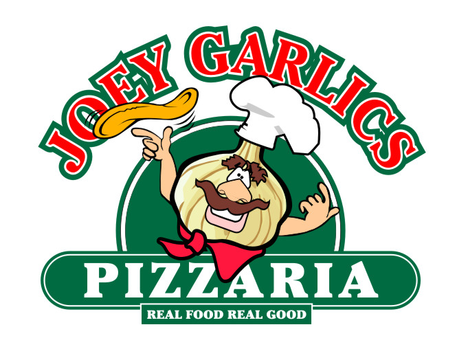
It's PIZZERIA and it's not REAL FOOD REAL GOOD. According to italian folk legend pizza was invented when some signorina from a poor family slapped some lunch leftovers on a freshly baked bread and served that to her family for dinner. hence, it's not real food, it's more like a poor peoples food.
Also, luenib is right, Joe Garlics is main name so it should be in place of your 'PIZZARIA'.
Graphic needs more work, it looks like you took a few commercial clipart's and glued different parts together. It would be better if you draw your own icon.
Traditional colors, strong bold type, could be tried in other places as has been suggested. Don't care for just the blob of green in the background could be better and the graphic needs to have the same weight/thickness of outline to work for me. Not sure about that bandana either and I would increase the size of the eyes to make the character work for me.
8 Comments
I think "JOEY GARLICS" should go in the place "PIZZARIA" is talking. A single stroke would look better.
Then "PIZZARIA" goes underneath "JOEY"
The good JOEY needs to be reworked. The traces are inconsistent.
Is it pizzaria o pizzeria?
.
The character borders on scary.. A cross between Mr.Potato Head and Angry Birds...but with human arms. Maybe it only disturbs me.. I'm weird.
I would try to make him more friendly.
Other than that~ it looks like it's supposed to for a pizzeria if you aren't trying to break any new ground.
BTW~ it's PIZZERIA not PIZZARIA!!!!
ha ha ha what?????
I cant in all good faith give any advice on this, because it is just to funny
It's PIZZERIA and it's not REAL FOOD REAL GOOD. According to italian folk legend pizza was invented when some signorina from a poor family slapped some lunch leftovers on a freshly baked bread and served that to her family for dinner. hence, it's not real food, it's more like a poor peoples food.
Also, luenib is right, Joe Garlics is main name so it should be in place of your 'PIZZARIA'.
Graphic needs more work, it looks like you took a few commercial clipart's and glued different parts together. It would be better if you draw your own icon.
works.
sorry too much going on to this.
Traditional colors, strong bold type, could be tried in other places as has been suggested. Don't care for just the blob of green in the background could be better and the graphic needs to have the same weight/thickness of outline to work for me. Not sure about that bandana either and I would increase the size of the eyes to make the character work for me.
show