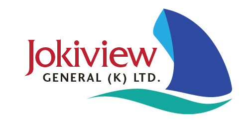
Jokiview General (K) Ltd Logo
kimuyu | Mon, 04/11/2016 - 14:41
Brief from client
Design a logo for a company involved in Export / Import processing, clearing and forwarding of freight.
Must portray the company as professional and established.
Very low budget :-)


8 Comments
Do they import / export sharks? Because that is a shark, not a boat. :)
There are probably too many colours in this. 4 for a simple logo is just too many. The Jokiview could be done in one of the blues so it matches better.
Ouch! :-D
Thanks for the feedback. Let me see how to de-shark this thing. :-D
I think I can help with that!
Genius. Am on it. Saved my life ;-)
I'm not sold on the type. I feel like I've seen that outdated font elsewhere. A more polished font would work better; those are some ugly serifs in my opinion.
I don't even feel the subtext is necessary, is it? Agreed on the colors; red doesn't work well with the blues and greens anyway. Stick with the same color scheme.
The symbol does need refining, too. Maybe one thing you can do to make it more interesting is make gnarly waves in it as well. Do whatever you can to convey a common icon in a new way.
Good luck.
I agree with the the Waffle and the The Kill.
I immediately thought of a shark when I saw this.
The curve on the base of the sail should match exactly the one of the wave. Here, it looks botched.
Pretty bad choice of font also. Serifs tend to make logos dated.
Like a lot of logos we see here, I sense a clear lack of research, inspiration and most importantly sketching. Let go of the mouse for a while and start doodling away, like your life depends on it!
Keep working on it!
wow there's way too many colors here it's hurting my eyes :)
you should rework on the symbol as well, try to maybe get inspiration from the internet.
I can see that we're looking at a big ship kind of from water level, but I think it's the colors of the boat itself that might be making people think "shark fin." Maybe if it was cream or gray it would be more recognizable as a ship, especially if you put the darker of the two colors on the back size of the ship rather than the front. That might make it easier to tell that it's a second side of the ship receding away from view. A cream or gray would also mesh well with the other two colors you have already in the logo. For me, the blue of the ship clashes with the blue of the water. I also like the suggestion of removing the subtext if you can, which would simplify the logo and make it more aesthetically pleasing. If you can't remove it, maybe you could make it a bit smaller and move it a tad to the left so it lines up with the bottom of the "W" in Jokiview?