Joyful Work
S H A D | Sat, 04/02/2016 - 17:43
Brief from client
This logo has good idea please work on it more
i want to work on it more help me fellow friends
This logo has good idea please work on it more
i want to work on it more help me fellow friends
8 Comments
I'm not sure what's going on here. The idea isn't clear or obvious enough. It just look too random.
Although it's I feel the logo is in a good path, it sure needs work, especially providing a meaningful brief. "This logo has good idea please work on it more" is nowhere near enough.
I think the typography is good, the shapes in the glyphs are related to the wrench. However, it's a bit hard to read.
Have you tried lower case letters?
I think the colors are fine too, I like that the black is not black, is a dark gray.
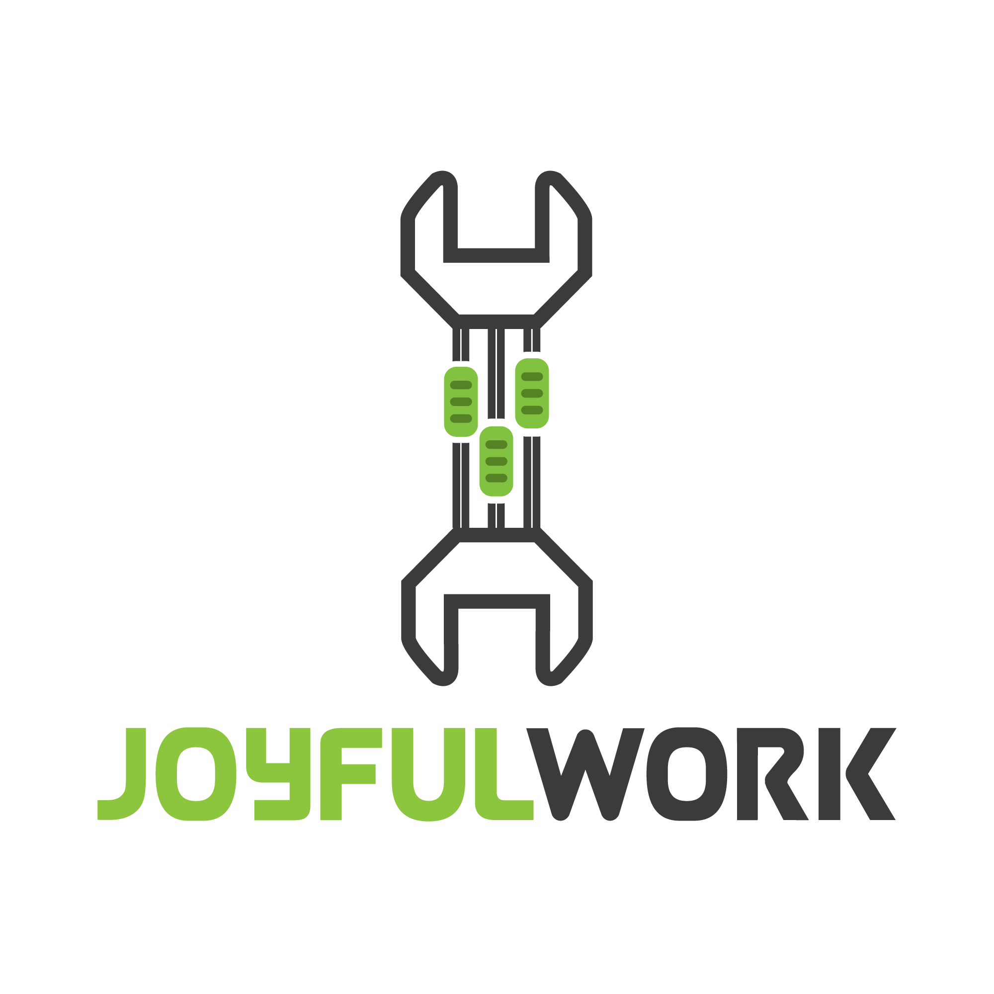
Not sure what the "handles" on the wrench are supposed to mean, they look like either equalizer handles, or even cars on a track, and they don't feel connected to the name.
Instead of double lines, try a single line.
Sorry for little description. it is equalizer and the wrench,
i need more help to improve this logo
What is the relevance of the wrench or the equalizer faders to the business this logo is for? Is there any meaning behind the name? Tell us a little about the project and it will help with giving a proper critique.
Not positive, but I believe it is for stock logos, so he has no real brief.
I like the name (for obvious reasons!) However, there is nothing "joyful" about the logo. The color scheme seems very "tech oriented" - is that what you are going for? If not then maybe the color scheme should be brighter (i.e. more joyful) And the symbol as well, think about: what does the wrench have to do with things? And what does the equalizer have to do with things? Is there another item that represents your message better?
The handle of the wrench represent the equalizer its means related to sound and music, and the wrench represent the work so when we work and also hear music during the work so its become joyful work.
This logo is for stocklogos but the admin told me that the idea is great but work on the symbol so then we will accept the logo.
Please help me how to make this logo perfect.
If you want to tie the joy of music to work I would suggest using something that would be more universally understood as representing music. The faders are much more tied to studio work and musical engineering. Basically, the only people who will get that are musicians or people who work around the production of music for live and studio purposes.