JR72 Plumbing & Heating
M@ | Tue, 09/27/2016 - 14:41
Brief from client
Client likes blue and green colours and is open to any ideas but wants to keep it quite simple
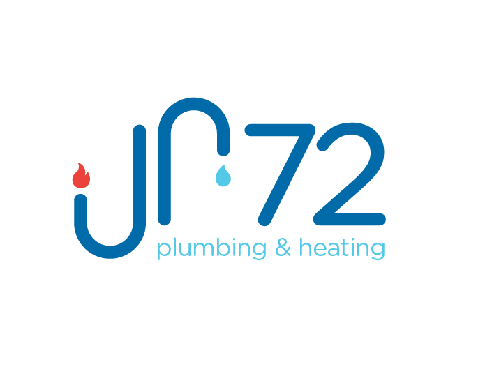
So yea, not a great brief to go from but here's what I've just finished working on as idea number 1
8 Comments
Just curious what the 72 has to do with anything? The JR and Plumbing and Heating work just fine without the 72...this does nothing to explain why the 72 is there.
The name of the business is not my choice, it is what the client has requested, as far as i know it's his Initials and the year he was born
I'm not using thumbs because I am not really sure how to explain what I think about this- but for me it's awkward. I think it is the J extends below and the R extends up above the other text. Makes it feel messy to me- have you tried having the R be the same height as 72? I do like your fonts tho (just not how they are laid out).
Hi Joy,
Yes The original way i had it was having the 72 up to the same height as the "r" but it didn't look right, the 72 was too big and overpowering
My main problem i that I didn't know if I as supposed to read anything in the symbol. I had to look at the title of the post to get it. I don't really see an R here, it's a bit disconcerting. It's hard to read JR.
On the whole, this looks pretty neat though, as always =)
Maybe adding the client's full name in the subtext would help.
Hi Shawali,
Yes this was my first thought after designing the logo.. How easy is it to read jr72? i asked a few of my colleagues and they said they could all read it fine but i do understand that for some it might not be obvious.. I will have to look at that.
Could you see that the "r" is to represent a kitchen tap?
It's not that unreadable, but I think merging the brand name and the symbol is too ambiguous. I stared at it for a few second wondering if I was supposed to read it or not.
As a symbol, it's pretty much dead on. You should just spell out the full name somewhere.
ah i see! I will have a play around, I have another option that I've been working on too, i will upload that