Brands of the World is the largest free library of downloadable vector logos, and a logo critique community. Search and download vector logos in AI, EPS, PDF, SVG, and CDR formats. If you have a logo that is not yet present in the library, we urge you to upload it. Thank you for your participation.
Yeah, it's clear you didn't put much effort into this batch you released. Sorry, just being bluntly honest here. And it's evident you didn't spellcheck either, which is a good indicator of itself.
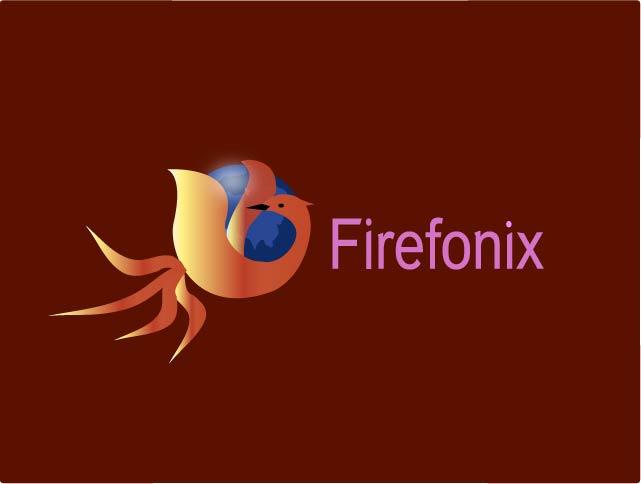
Plus, this is a ripoff of an existing logo, so that by itself doesn't look good.
The brief says “just fun,” so I'd presume he was trying to replicate the Firefox icon in his own style for the vector experience, rather than as an actual branding to be implemented. I also think we should try to be more welcoming and kind to ESL folk (and frankly, everyone).
If that's the intent, that's all well and good. I'm not intending to be abrasive, just delivering the hard truth that I believe a lot of his logos appear underdeveloped. I'm not intending to target ESL people, even. Heck, even those who are native English speakers butcher the language. I'm just strictly judging based on design...and yes, the occasional spelling error just to be well-rounded in my attention to detail.
sir, it is just for fun and for self inspiration. i have written the name fonix instead of phoenix intentionally. if xpress money can be written instead of express money so why it not? however, though it is similar to an existing logo but even the globe is not copied. everything is new without the theme and the font. it is just for fun.want to see more fun? look at the attachment.however, please comment on other commented logo of mine.
I think the difference would be that “xpress” still pronounces the same as “express,” whereas fonix would be pronounced more like “phonics,” which is not pronounced the same as phoenix. Hopefully this helps elucidate why this particular spelling (Firefonix) is out of place. :)
First of all when you decide to use a gradient, you're either a beginner or a pro.
Because there is a fine line as to where and when you should use gradients. You've also used bevel on your second logo which you should absolutely never do. Your font choice could work but i can't see it connect right now maybe try a rounded Sans Serif?
You have allot of work cut out for you. These type of "fun" projects are a good way to improve yourself. Keep at it.
13 Comments
You mean "FirePhoenix?"
yes
Yeah, it's clear you didn't put much effort into this batch you released. Sorry, just being bluntly honest here. And it's evident you didn't spellcheck either, which is a good indicator of itself.
Plus, this is a ripoff of an existing logo, so that by itself doesn't look good.
The brief says “just fun,” so I'd presume he was trying to replicate the Firefox icon in his own style for the vector experience, rather than as an actual branding to be implemented. I also think we should try to be more welcoming and kind to ESL folk (and frankly, everyone).
If that's the intent, that's all well and good. I'm not intending to be abrasive, just delivering the hard truth that I believe a lot of his logos appear underdeveloped. I'm not intending to target ESL people, even. Heck, even those who are native English speakers butcher the language. I'm just strictly judging based on design...and yes, the occasional spelling error just to be well-rounded in my attention to detail.
“juding”… lol
>_>
sir, it is just for fun and for self inspiration. i have written the name fonix instead of phoenix intentionally. if xpress money can be written instead of express money so why it not? however, though it is similar to an existing logo but even the globe is not copied. everything is new without the theme and the font. it is just for fun.want to see more fun? look at the attachment.however, please comment on other commented logo of mine.
I think the difference would be that “xpress” still pronounces the same as “express,” whereas fonix would be pronounced more like “phonics,” which is not pronounced the same as phoenix. Hopefully this helps elucidate why this particular spelling (Firefonix) is out of place. :)
hmmm, i understand. thank u.
First of all when you decide to use a gradient, you're either a beginner or a pro.
Because there is a fine line as to where and when you should use gradients. You've also used bevel on your second logo which you should absolutely never do. Your font choice could work but i can't see it connect right now maybe try a rounded Sans Serif?
You have allot of work cut out for you. These type of "fun" projects are a good way to improve yourself. Keep at it.
Guys, Hooked on Firephonics is a browser that teaches kids phonetics, like Hooked on Phonics did for American kids in the 90's. ;-)
bad, very bad