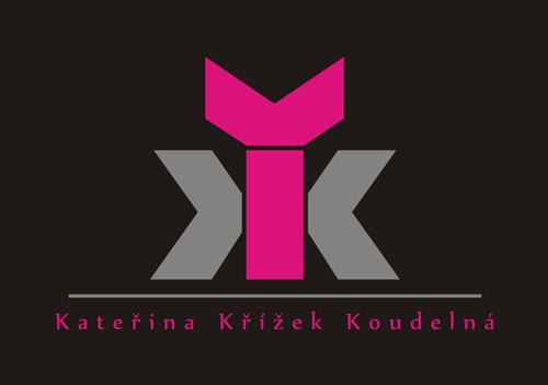
Katerina Krizek Koudelna - personal logo
Don Cruz | Tue, 02/07/2012 - 22:47
Brief from client
The customer required to incorporate the Triple K. The company is engaged in the manufacture of jewelery and earrings and jewelry logo should evoke.


9 Comments
first thing i read were the letter's i and x. i don't think the symbol defines that they are a manufacturer of jewelry. I don't see the ring edge you speak of.
Please click on the image for proper display in the preview is distorted.
I thought I was the only one so I started deleting cookies and testing in other browsers but nothing worked.
This distortion started since yesterday, after maintenance.
At first glace you have no clue what type of company this is.
I would try to incorporate the triple K a little better.
Maybe choose more elegant colors since its a jewelry company
This symbol looks a little industrial. In my opinion, the symbol-font is too heavy to be a jewelry logo, and the colors does not works. Maybe gold, silver, claret etc?
the 2 Ks look more like X..and i don't see the ring!
For those who do not see the shape of the ring.
I think that's too rebuscated, a design needs to be comprehensible to everyone
i see the issue here. the stone portion you have, you're showing the braces that is supposed to hold the stone right? it's a profile view. i still think if a lot of people are having issues identifying it, it won't work.