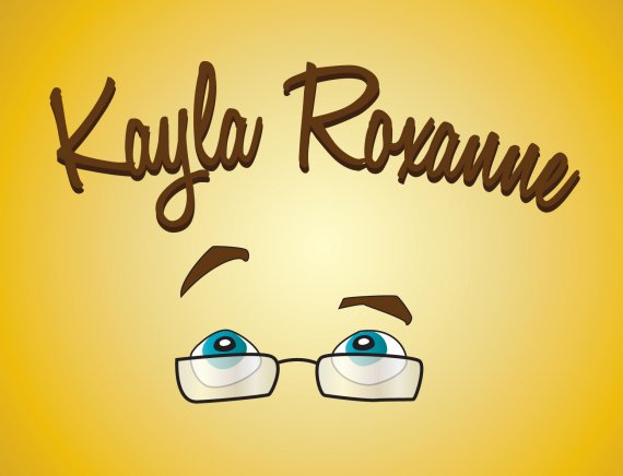
Kayla Roxanne
Brief from client
Graphic Designer Logo

Okay, maybe I should have described a bit more before I put the design up there... it is meant to be cartoony. I want it to represent me... I do visual art, cartooning, and Graphic Design. The eyes and glasses are an iconic representation of me (like... my face). The type is literally the closest typeface to how I actually sign my name and write. The picture will basically only be for an online presence mostly in banners and pictures as I start selling things online. It doesn't really need to work in Black or White or anything like that. I'm aware that background gradients arent part of a logo design however I have the yellow gradient behind because I think it fits best. I need critique based upon visually whether this works together or not.


4 Comments
After the description you gave, is ok. As a logo it doesn't stand for me, is not a logo, too illustrative. Only online presence- you ll be surprised , surely .
Ok, but in this view, the 1st version looks better, with type below the face and not on top. It gives the impression of "...Checked & signed..." So, maybe go back to version 1. You may try to get all items a little closer to each other, to obtain a logo impression. I would try to slant the eyes on the left side at an angle above the Kayla.
seria bueno que lo presentes con fondo blanco a ver como funciona en esa variante de color
I like the 1st version better. I just think the text below fits into a better block. But if you are going to go with version 2, I would switch the raised eyebrow to the right side so that it isn't so close to the "y" in Kayla. One other thought is that I think the drop shadow on the text is a little too close to the brown color of the text. They almost look like the same color.... I like the brown text, but I might like it better if it was the blue color of your eyes. I like color and the brown and yellow makes it look slightly drab.