Brands of the World is the largest free library of downloadable vector logos, and a logo critique community. Search and download vector logos in AI, EPS, PDF, SVG, and CDR formats. If you have a logo that is not yet present in the library, we urge you to upload it. Thank you for your participation.
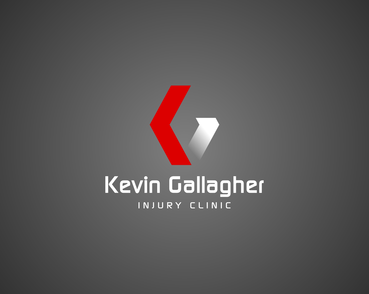
I see what you're trying to do here, but I'm not sure it's working. I keep thinking, Renault.
That font has much nicer caps than lowercase. Injury Clinic looks better than the main text. The lowercase 'a' needs to be reworked.
I think the colours are nice, but it doesn't say Physio.
I created this logo for a lady who started a similar business. It's quite feminine in comparison, but it was to show you that there's a hint of what she does worked in to the typography. If it's not obvious, the 'B' is a hand healing a spine/neck.
2 Comments
I see what you're trying to do here, but I'm not sure it's working. I keep thinking, Renault.
That font has much nicer caps than lowercase. Injury Clinic looks better than the main text. The lowercase 'a' needs to be reworked.
I think the colours are nice, but it doesn't say Physio.
I created this logo for a lady who started a similar business. It's quite feminine in comparison, but it was to show you that there's a hint of what she does worked in to the typography. If it's not obvious, the 'B' is a hand healing a spine/neck.
Yeah, the symbols looks too much like Renault, as if this business was one of their corporate entity.
The rest is really good though, beside that kerning.