KidMin Live
brandonmaddux | Thu, 05/31/2012 - 23:50
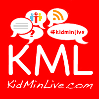
Brief from client
This is the website that is currently in the design/development process. I feel like the logo could use a little work, but have tried many things and ran out of ideas. So critique and suggestions are welcome.
The websites slogan is Innovating Children's Ministry. So I hope that the logo expresses that.
4 Comments
I don't like it at all. Hard to read, bad font, too many symbols it's chaos.
Comic Sans alert!! Abort! Abort!
As schedio says, too many things going on and never EVER use Comic Sans.
What is a "kids ministry" anyway?
Holy Christ I didn't even notice the comic sans. I guess it was the rest of the logo that was taking over my mind.
What you have there are the letters 'KML', plus some web junk. Is that a logo?
Drop everything on the top, leave the domain name out (Google doesn't have a '.com'), find a decent typeface, then do something interesting or innovative.
What is kidmin? Doesn't sound healthy.