Brands of the World is the largest free library of downloadable vector logos, and a logo critique community. Search and download vector logos in AI, EPS, PDF, SVG, and CDR formats. If you have a logo that is not yet present in the library, we urge you to upload it. Thank you for your participation.
Version history
Version 1

- I
- S
- T
- C


2 Comments
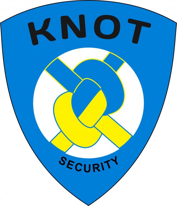
Mmmh, this isn't looking really good, I'm afraid. What strikes me the most is that it feels like a old logo from the 60's.
I'm pretty sure you didn't do any research before hand neither did you sketch a few hundred ideas of paper. You probably created this in one fell swoop on your computer. Unfortunately, this is not how good logos are made.
There's might be something to do with that knot idea, but the whole shield thing is way over used as far as security firms are concerned.
Globally, this is really boring. It doesn't give any idea of professionalism or expertise.
Restart from scratch, with a proper creative process: research (who is the competition, what their brand looks like and how it works), inspiration (www.dribbble.com www.logopond.com www.pinterest.com), sketching, sketching and even more sketching and finally execu... NOPE! More sketching! This is really the most important part of the whole process. This is where ideas flows almost magically and skills are honed.
Good luck!
the colors don't work, same for the text font. you should maybe drop the shield symbol ...who's used and overused.
i'd start from scratch, get ideas and inspirations from the internet and...don't give up