KUAREL
G13Design | Sun, 01/08/2012 - 00:59
Brief from client
What 3 things would you like to communicate to your audience through your icon design?
1. Kuarel = Quarrel / Fight / Argument / Dispute / Competition
2. Fun
3. Social
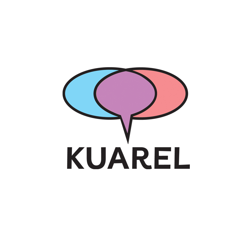
Venn Diagram idea implemented. A little bit less of an agro font.
6 Comments
not working for me sorry
I know it would be difficult to add another bubble to the mix, but why only 2? what do they mean when you want to communicate 3 things?
One of the things you want to communicate is also the name of the social group and is the only part of the wordmark.
This design says: Fun + Social = Kuarel. I would think that Kuarel + Social = Fun.
Technically there are 3. My idea behind this was an argument symbolized by 2 speech bubbles. They come together as one and that points to "KUAREL" as the solution. Maybe it just doesn't translate or the bubble is just too generic to make an impression or so generic that it doesn't entice the viewer into thinking that much about it... The people behind this have scrapped the project for the time being anyway (or are running off with the logo?). I was on Logo DesignLove a minute ago and came across a link to this:
http://blog.eachday.com/2007/8/1/bubble-logo-insanity
So- it's time to get rid of this idea anyway. As a graff writer I used the bubble a lot. It fell out of fashion there too. : )
Its true, sometime it has to be used. But as long as its not used in the conventional way like the majority the other logos then I believe it can work. Quite digging the typeface though give it a more inviting feeling. Play around with other colours though to give it a stronger and more memorable feel.
Also if you do run with this one, make sure its your only one in your portfolio (like me) : p
From your original design to this.. I don't see any change except introducing the chat bubbles to skittles and m&m's. Adding color didn't do anything at all to it. I say get rid of the Speech Bubbles and/or find another way of utilizing them. But I would stay away from the speech bubbles unless you really get creative with it and make it stand out. Other than that, let's play with the Typography