LA MEZCALERA
revistagolfa | Tue, 12/03/2013 - 20:09
Brief from client
Typical mexican food & drinks place in Guanajuato. La Mezcalera combine tradition & innovation in a simple & pure style.
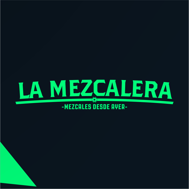
Typical mexican food & drinks place in Guanajuato. La Mezcalera combine tradition & innovation in a simple & pure style.
3 Comments
It has the proper styling so you did fine there. It's nothing new looking so you have tradition but it doesn't really convey innovation.
The kerning really needs to be addressed. Right now there is no consistency with it right now.
The shape at the center of your arched line is too small and kind of lost right now. It needs to be larger and I would leave more space on either side of it so it separates from the arch.
What is the triangle to the lower left?
Personally, it looks like you're on the road to a perfectly adequate logo but I would like to see you play with the innovative side and give this some personality. Happy designing.
I like the font choice. But the bad kerning makes you think the letters are going to fall of the arch. And yes, the shape in the middle of the arch is too small. You could lose it.
Overall, the logo is clean and simple but it kinda needs a bit more creativity from you.
I totally agree with the opinions above !