Brands of the World is the largest free library of downloadable vector logos, and a logo critique community. Search and download vector logos in AI, EPS, PDF, SVG, and CDR formats. If you have a logo that is not yet present in the library, we urge you to upload it. Thank you for your participation.
LAB. 23 logo
romy_roma | Mon, 12/02/2013 - 16:41
Brief from client
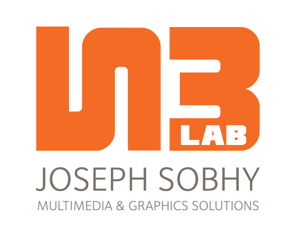
A logo for graphic company contains 2 and 3 numbers
This is an interesting approach but I'm not sold yet. The elements of your symbol aren't aligned vertically and that's bugging the crap out of me. I think you should lose the period to the right of the symbol. It's throwing off your horizontal alignment and I don't find it necessary at all. Flip the 3 (B) in your symbol vertically. The larger end is currently on top. I'd like to see where you go with this and also any other ideas you have for this. Good luck.
I really like the idea of turning the 2 around, it's clever and not very obvious at first. A good start.
I agree with Jon the alignment issues. The font you're using has irregular widths and makes lining things up a pain. Play with the nodes and square 'em up. The font in your subcopy doesn't do a thing for me though.
"Multimedia" and "Solutions" are tired old buzzwords that have lost their buzz. From a marketing standpoint, they don't do a lot for you. You may want to reconsider.
My biggest concern is the typo in Multimedia. That's not a small error, it's the name of your company. Your carelessness and lack of attention to details speaks volumes. Even in a rough draft situation, something like that should have been noticed and corrected before presentation for critique.
All in all, I'd say you're on the right track, just clean it up, put some more thought into it, and try to be more careful in the future.
2 Comments
This is an interesting approach but I'm not sold yet. The elements of your symbol aren't aligned vertically and that's bugging the crap out of me. I think you should lose the period to the right of the symbol. It's throwing off your horizontal alignment and I don't find it necessary at all. Flip the 3 (B) in your symbol vertically. The larger end is currently on top. I'd like to see where you go with this and also any other ideas you have for this. Good luck.
I really like the idea of turning the 2 around, it's clever and not very obvious at first. A good start.
I agree with Jon the alignment issues. The font you're using has irregular widths and makes lining things up a pain. Play with the nodes and square 'em up. The font in your subcopy doesn't do a thing for me though.
"Multimedia" and "Solutions" are tired old buzzwords that have lost their buzz. From a marketing standpoint, they don't do a lot for you. You may want to reconsider.
My biggest concern is the typo in Multimedia. That's not a small error, it's the name of your company. Your carelessness and lack of attention to details speaks volumes. Even in a rough draft situation, something like that should have been noticed and corrected before presentation for critique.
All in all, I'd say you're on the right track, just clean it up, put some more thought into it, and try to be more careful in the future.