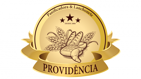
LANCHONETE & PANIFICADORA PROVIDÊNCIA
@davisondesigner | Wed, 12/04/2013 - 19:23
Brief from client
Cliente solicitou uma arte para Sua panificadora que agora esta ficando mais moderna e atendendo outros gostos como serviço de lanches!


9 Comments
Hi. Can you type in English please, so everyone can read what you have to say?
Thanks.
Both worked in the maturation of my idea I do not know if that will please the tastes of all who come to see! Reviews you can ask everyone! Logo THAT THIS GOOD?
The brief helps understand what you are trying to achieve and for who. People are here from all over the globe which is why english is always requested.
Friend, and This is a logo for a Bakery and Lunch ... I would like the opinion of everyone regarding the same! Is it good? Not this Good?
The illustration of bread and wheat crops is obviously a clip art you picked up from this site: http://www.freepik.com/free-vector/bakery-vector_583077.htm
It really shows because there's a wild gap between it and the rest of the logo, which really poorly designed in comparison.
I commend you for going for a retro style, but never EVER use an element you didn't create yourself in your design, especially when said element looks far better than your own work. It will only make your work look amateurish and lazy.
It also feels like you didn't do any sketching before hand and that you used Illustrator as a creative tool while it should only be an execution tool.
You need to work on your skills and processes. Keep it up!!
Good luck
PS: it's only fair to ask for comments but don't hesitate to give your feedback on the other posts as well.
Not trying to be difficult with the English request. Just want to be able to give you a fair critique.
Aside from the clipart issue the first thing that got my attention is the perspectives in the ribbon versus the text that's on it. The outsides of the ribbon are tilted ver dramatically but the text is more upright and less influenced by the ribbon. The discrepancy makes the text separate from the element rather than appear as one. My suggestion would be to make the outsides of the ribbon less dramatic.
Another thing you have to consider is the smaller text you have. It's small in this display and it disappears when you scale your logo down.
Your effort here isn't without merit but I feel like you're a little ahead of yourself. Try backing away from this in color until you get more of a solid foundation and then dial it in accordingly.
I wish you the best of luck and hope that was of some help to you.
Thank you friend. Actually put that logo with the intent to test the site. I see that and quite useful because as you can see I got enough criticism to discourage putting someone would actually exposing your real work here. In order thank you for criticism was very useful for me tomorrow I'll be posting some of my work ... I'm not a professional one more day plan to get there.
That's the spirit! Don't hesitate to post more of your work, we'll be happy to give your feedback and help you.
There are a lot of designers here of different level of skill and a lot of them have a great eye for things. I know I've learned a lot by posting here or just being part of the conversations. Looking forward to your work.