Leshni
Leshni | Fri, 03/14/2014 - 19:29
Brief from client
Actually this is a personal logo to present myself.
1 - Create a simple and direct logo;
2 - Play with typography;
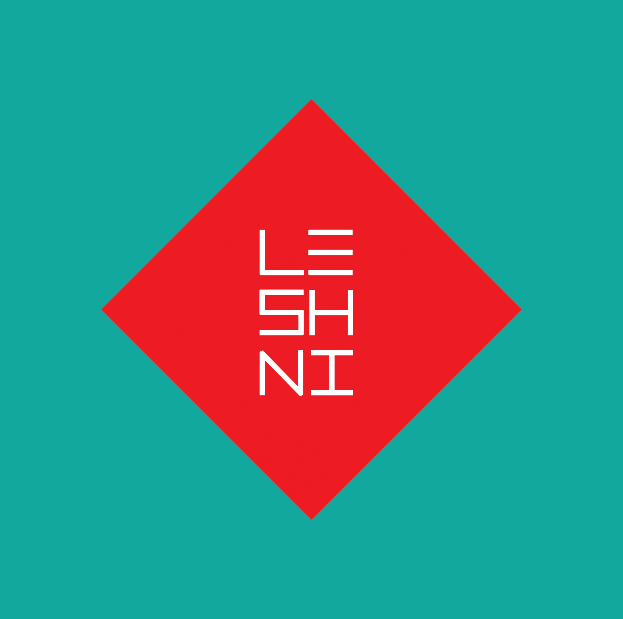
With the square I tried to demonstrate the multidirectional knowledge that the professional needs to work with comunication.
The arrangement of the types was inspired in oriental style and the flat design was the flat design was chosen cause I like it.
Kidding, I've chose that way cause is easier to apply in some press process (Silk-screen).
2 Comments
So if this logo is to represent yourself, is it your 'personal' business and if so, what business? If not, what is it to be used for? Are you a student? What course? Need context. ;)
I think it is a nice start of an idea. Colors are nice, I like this blue - an interesting variant. Though i am very sceptical to this (romboid) form , here it stays nice in my opinion. I guess if you play mofe with the letter spacing as well as to tryseeing how this will look when very small or printed, because the letters are not fat - you need to ensure legibility in smaller size as well.
Thanks