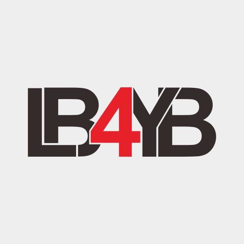
Listen Before You Buy
andrip | Sat, 11/12/2011 - 19:39
Brief from client
I'd like a logo that's striking but easy on the eyes, that grabs your attention but isn't too busy. I'd like to be able to use something that has either the site's name or an abbreviation of it (LBYB, LB4YB, LSTNB4UBY etc). It could either be music-related (maybe using headphones, or a turntable, or a vinyl record etc) or just be text that looks cool as shit, or even just something on a picture or abstract image.
Designer email: andripermana@hotmail.com
4 Comments
I like it. If you reversed the "Buy" B, it would give you better symmetry overall.
This is very confusing for the reader.
Looks really crowded and it definitely isn't 'easy on the eyes' like your brief requested.
I think the concept is there, but the lack of space between letters makes it hard to read at first glance. Try thickening up the outlines of each letter to give the appearance of more space.