Little Leaf Party Planners
Joe White | Thu, 12/13/2012 - 01:02
Brief from client
we are a luxury party planning business for CHILDREN'S parties. I really love the logo you did for 'natural's best' so something similar to that in the shape of a brown/orange autumn leaf would be nice.

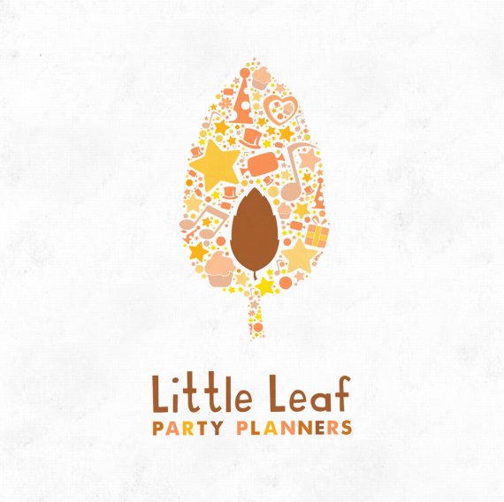
Logo design for the good people at Little Leaf. Quite a clear brief, I used the collage to depict the various sides to a party, with a bit of magic and twinkle. I would hope its a design that would capture a child's imagination as well as the parents. Would be great to know your thoughts towards this design. I'd like to submit something for an award but I don't think these are up to it just yet.


6 Comments
Nice work!
fonts could be more childish and color would be more colorful autumn colors.
It's nice, but also intricately detailed. There are elements so small that I don't see how they could possibly print on anything business card sized. With that said though, it's overall pretty nice. the symbol and colors themselves are pleasing and the font is fun as well. Good job. One thing though, the kerning between the two "t's" in Little looks a bit spaced out.
Also, I don't know what the person above me would have you do. Maybe make the font comic sans and make the colors neon yellow and neon orange? I don't really get their suggestions...
I red thumbed the symbol, not because it's bad, but as thecuraga said, it's way too detailed. The smallest elements will disappear as soon as your downsize the logo.
Other than that, I love it. The colors are spot on. So are the fonts. Congrats.
I don't really understand why its an issue for the smaller elements to disapere. The idea being that even at this view, the smallest elements are just tiny details.
The printer wont refuse to print it? and the end results will look how ever the end results look. I in fact love the way these logos look in small, You can still see theres alot going on, even if you cant work it out at that size.
Why each time I see a beautiful logo, it's always a Joe White logo ? ^^