Brands of the World is the largest free library of downloadable vector logos, and a logo critique community. Search and download vector logos in AI, EPS, PDF, SVG, and CDR formats. If you have a logo that is not yet present in the library, we urge you to upload it. Thank you for your participation.
Version history
Version 1

- I
- S
- T No votes yet.
- C


4 Comments
Your type is too small, it needs to be bigger. Try separating the icon from the type.
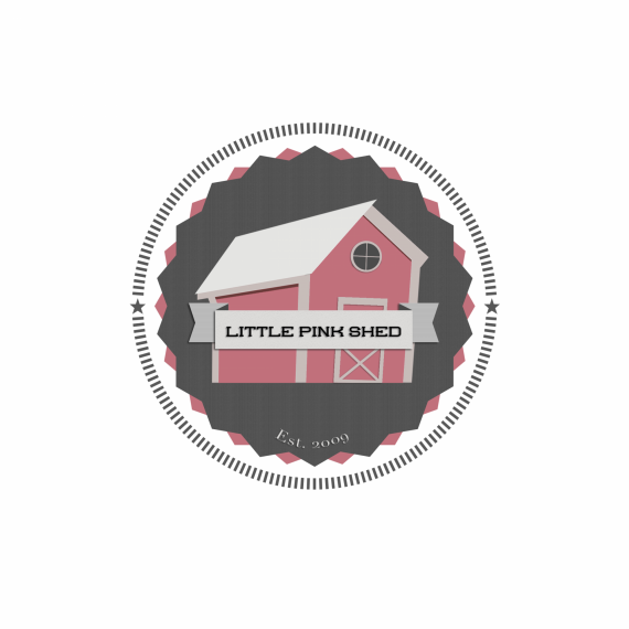
Too many elements IMO
• Barn
• 2 Badge backgrounds
• very detailed/repetitive outline
• stars
• ribbon
• store name
• est year
• drop shadows
Try incorporating the ribbon, badge and outline to be one element in which the other elements are placed. Simplification is key for a logo. I agree about the font being too small, try a font that isn't so wide so you can take up some more of that empty space above and below the words.
I wouldn't use "est 2009 in a logo unless it is more incorporated into the rest of the design instead of floating on top of another element.
I attached a file to show you what i mean about the border/badge/ribbon simplification. I would lose the stars, honestly. They get lost in all the detail. Or you could replace the barn window (that is too detailed with the panes and shadow) with a star.
The type is too small on everything, Also less is more when it comes to clean logos :)
Maybe have a little pink shed next to big fun writing, the name is fun, have fun with it. Also brighten it up a bit :)
Great feedback! Thanks so much everyone.