Lockswood logo
kherr91 | Fri, 02/07/2014 - 17:20
Brief from client
They are a real estate company based in london that specializes in helping clients find well priced flats and houses.They are holding a contest for a new logo.
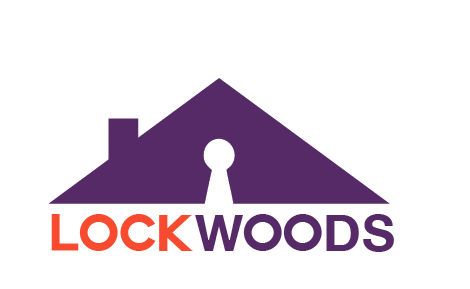
I'm still developing the idea,but i wanted to use the roof outline to represent the real estate side of the company and the keyhole in the middle of the image i used to incorporate the name.I also had a different version of the key hole instead of white it was orange.It is still very rough and new ideas or tips are welcome.
7 Comments
its coming out pretty sweet i think, i like the idea with the negative space, but maybe for a visual submit an idea with the orange key hole, overall im liking the fonts, symbol, and the colors are not bad. they dont scream real estate business but it works.
Nice logo. Check the centering on the type.
Perhaps the Lockhorns could use the Lockwoods.
LOL minimum wage is not a goal! i've had it all wrong all these years! :( lol
It's an easy thing to miss. ;)
here is the orange version.The colors were already the company colors.They didn't specify if they wanted to keep those or not.Pretty minimal in the guidelines.
Nice man !!!
I strongly prefer the version with the negative space. The orange and purple work fine separated but not directly bordering each other. Too much blue and red next to each other, especially for RGB displays.